When we set out to build a Squarespace website for a woman working in corporate life, I thought I knew what we were going to learn.
In fact, I was so sure of myself I could have written the post blindfolded in advance. It went a little like this: When you work in a corporate job, your portfolio website can’t be full of hot pink, pictures of you holding a disco ball, and Beyoncé quotes (see my site). Plus, with a more traditional job, you’re often also bound by privacy and ethical rules. (If you have a high security clearance, you can’t go listing all the projects you’ve worked on recently, unless you’d like to spend some time in jail.)
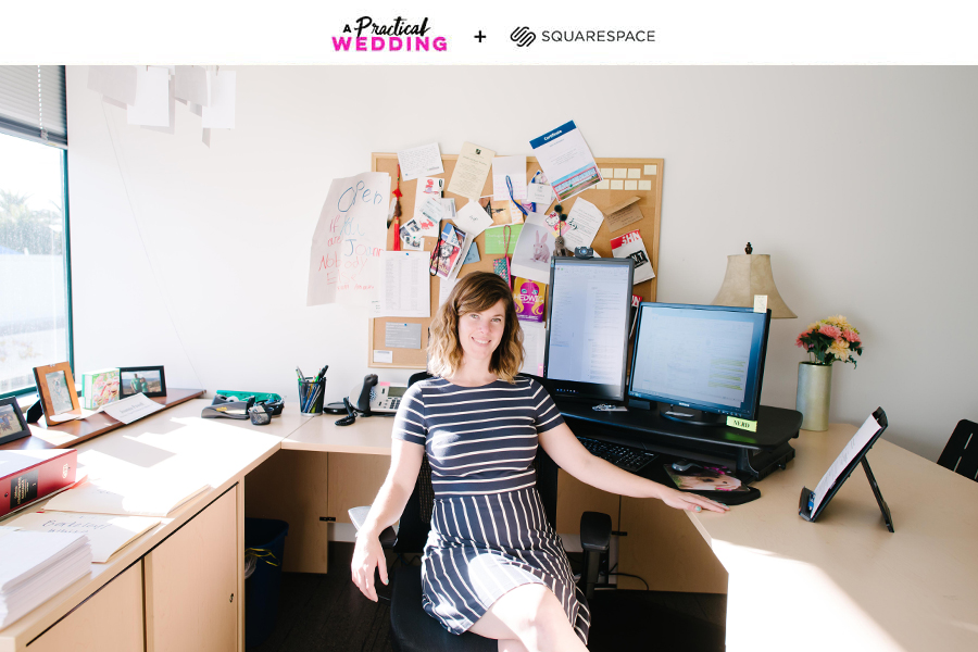
And all of that is true. And I’m still a little sad about the lack of disco balls on traditional portfolio websites. But when we set out to build a website for Joanna, an education lawyer who happens to work at the same firm as my husband (that’s her below), that actually wasn’t what I learned.

What I came away with was this: building a website for a woman in a corporate job, I was reminded of that damn universal being-a-woman-in-America truth. You know it, I know it, we all know it: women have a far harder job selling ourselves, because we’re told from birth not to be too presumptuous and never to show off. If we want to get ahead, we need to smile and keep our heads down. Probably even on our portfolio website. Probably, all the damn time.
I’m not a businesswoman. I’m a business, woman.
For years, I’ve been annoyed by all the talk in creative fields of “personal branding.” In fact, if I have to go to another talk on building my personal brand, I might tear my eyes out of my skull. I find all the talk of personal branding irritating (I’m a person, not a goddamn brand), but besides that, I haven’t internalized it much. I still beg people to help me when I have to write things like bios, sales sheets on me, or even a personal website. Because while I will brag about any other woman till you turn out the lights, bragging about my accomplishments in the third person still feels like slowly removing my skin with sandpaper.
But here is the thing. Because of those countless talks on personal branding I’ve attended, I also know that I have to do it. Because I’m in a creative field and have a public profile, I’m practiced in the nuance of sharing my life (and my face), while knowing where the line is for me. Because I’m omg-so-well-versed in the internet being forever. (You want to read a DECADE of my personal writing? Because it’s all right here.) I know what I’m okay with putting out there—and even what I need to put out there—and I know how to get comfortable with it. Because of all that personal branding (maybe-not-actually) nonsense, some of my female cultural conditioning has been stripped away a little bit, day by day, and year by year. And I’m pretty okay with having a website with my face plastered on it, where I dress for the job I want. (P.S. Stay tuned for that website getting a long overdue update next month.)
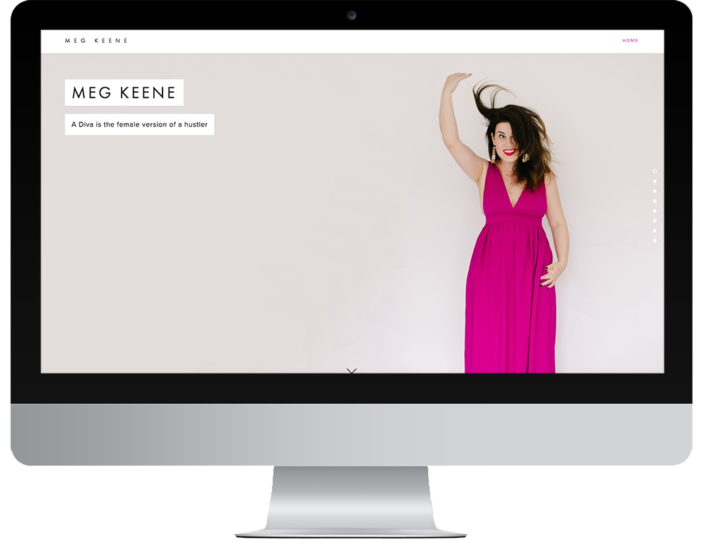
When I started working with a woman in the corporate world, I was suddenly reminded of what it’s like to work in a male-driven environment, and just how much “put yourself out there” is not the message you internalize daily. Would I have had a website with my face on it when I was the only woman in my department in an investment bank? Hell to the no, my friends. Even eight years later, the idea makes me want to crawl into a hole and hide.
NOT QUITE BUTTONED-UP, NOT QUITE DISCO BALLS
Suffice to say, when I sat down over lunch to talk to Joanna, I’d forgotten all that. I hadn’t pondered my past life in the corporate world in years. So after we got our iced tea, I started hammering her with the list of questions that everyone in my woman-led-creative-first professional world has been trained to answer at the drop of a hat. What kind of lawyer do you think of yourself as? What’s your dream professional goal? How do you want to present yourself to the world? What’s your visual professional style? Or, TL;DR: What’s your personal brand?
“I don’t know.” She said. “Not like, a buttoned-up lawyer. Like a former teacher who’s also a lawyer? But also… I do NOT want to look like I want a new job, or like I have opinions that my clients wouldn’t agree with, or anything like that.”
But you know me, and I’m relentless, and I was buying her pizza and building her a website, so I figured I was paying for the right to harass her about her future. Which I did, until I finally got her to say really quietly, “Well, I think maybe… I’d like to run for some sort of public office in the future…” At which point I obviously cued the balloon drop I had pre-staged at the restaurant (if only), and was like, “OH MY GOD YES. SO THAT IS HOW WE POSITION YOU.”
Because here is the thing. My privileged male husband, who has the same job as Joanna, will tell you at the drop of a hat that he’s fully expecting to make partner one day, and he’d really maybe like to be a judge too? And he has plenty of opinions, and he doesn’t really care if his clients like them or not. Besides, a fancy website might help him get or keep clients, which might help him make partner even sooner, so obviously he should be made to look as good as humanly possible. #men
Why the difference? Because men are raised to ask for what they want. (If not to take what they want, but that’s a whole different story.) Women are trained to make ourselves smaller and to never make it look like we want more than we have. And if there is one place that story is reinforced over and over, it’s in corporate life.
You don’t always get what you want, but you can get what you need
So we set out to build Joanna a kick-ass website. With her face on it. Where she looked smart and accomplished AF (because she is). And like anyone might offer her an amazing new gig at any moment (because that’s a good look for everyone).
Or, I suppose I should say, when working with the rabid feminists of APW, you don’t always get what you want, but you get what you need. And to Joanna, you’re a badass, and I hope you like the site. (If not, Squarespace makes it really easy to change it when we stop looking.)
So, with in mind, here are some things we learned while creating a website for a young lawyer who might one day want to run for office. (And we hope she will.)
Talk it out: We took Joanna out to lunch to talk about what she wanted out of this website we were promising her. On the fly, she came up with a mission statement, some thoughts about how she sees herself, and the ways she’d like to talk about herself online. Then we sent her to do the homework of coming up with a bio and refining some of the ideas we’d discussed over lunch. And then Joanna did the thing we all do: she went home, sat down in front of the computer, and spent hours honing and refining and second-guessing herself on everything down to verb tense and completely overthought things. And it’s not that the stuff she turned around was bad. It’s just that we wished she hadn’t put herself through so much agony doing it, because as her self-appointed new friends, we made her go with her first draft anyway.
So if you’re a perfectionist, save yourself the trouble and recruit your most creative or writerly friend to talk in real time over dinner, and bribe them to take notes for you. Some questions you can answer are:
- How would you describe what you do?
- What’s important to you?
- What makes you different from other people in your industry?
- What are you trying to change or improve in your profession?
And it’s always important to remember that the phrase you come up with now isn’t a life sentence. (Sentence. Get it? Someone help.) One of the reasons we like using Squarespace for our projects (hey, The Compact) is because their software is legitimately user friendly. So if tomorrow you change your mind and decide you actually want to be the host of Night Court instead of a Federal Judge, you can change that with just a few clicks. So try and channel the truism that done is always better than perfect. And remember that you’re probably going to come up with better copy talking to someone you trust over a slice of pizza rather than sitting in front of your laptop trying to will genius out of your fingertips.
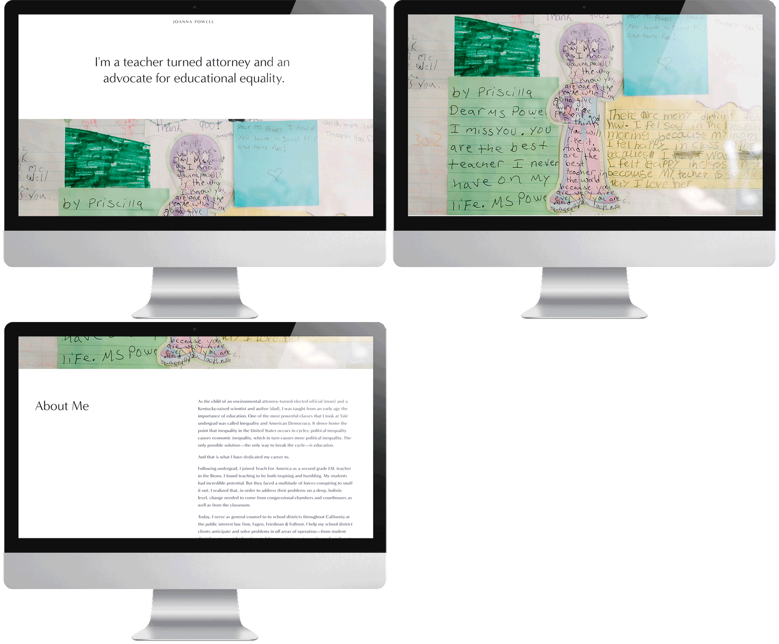
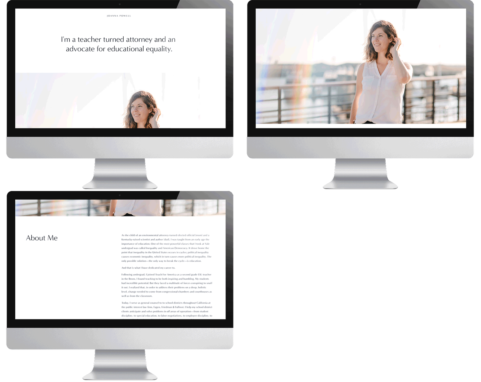
It serves no one to make yourself smaller: One of the things Squarespace does better than anyone else is website templates that showcase big impactful photos. But when we first met up with Joanna, she said she didn’t want her face to be the front and center of her online presence. So we tried to be respectful of that wish. Maybe we could use some stock photos? (Squarespace does have that sweet deal with Getty images.) Maybe we could take some photos of the student artwork Joanna has hanging in her office, from when she was an AmeriCorps volunteer? But the end result of those efforts was a website that was… full of stock photos… not full of Joanna. And we realized we weren’t doing Joanna any favors by enabling her to shrink herself. So we played around with a new template that let us show Joanna in her element, and I’ll let you tell me which one is stronger:
Option A (No Joanna):
Option B (Lots of Joanna):
A pro tip on headshots: There are lots of ways to get a headshot that looks nice and isn’t a random selfie you took at an event three years ago but you keep using because your makeup looked good that day. If you’re looking for a more affordable alternative to traditional headshots, the fall is when most photographers are offering inexpensive mini-sessions (usually twenty to thirty minutes for $100 to $150 or so). And sometimes even professional headshot photographers will get in on the game (our fave Sarah Deragon offers year-round discounts for nice folx who need nice pictures). But you can also set your iPhone to portrait mode, put on a nice blouse, find a solid colored wall or other plain backdrop in your neighborhood, and ask a friend to hit the button for you. I sent Maddie to Joanna’s office to take some photos on her lunch break, and they didn’t even have to go a full block to get the photos we ended up using on her website. (For more advice on how to fill your website when you’re not a creative, you’ll want this post.)
Surround yourself with people who lift you up: When we first asked you guys what questions you had about designing a website for non-creative professions, a few people raised the concern about marketing yourself while you have an existing job. And while Joanna made it clear she is not looking for a career change (this website is for other professional growth opportunities, like the committees she serves on), we kind of wanted to push back on that idea a little bit. Building your online presence is a perfect opportunity to dig into your accomplishments, your career goals, and start messaging to the universe that you have bigger plans than where you are right now. But it really helps to have cheerleaders in your corner.
When Joanna mentioned she might want to run for office one day, Maddie and I were both like, “GREAT LET’S RUN WITH THAT.” Otherwise, it’s really easy to get stuck in a loop where you downplay yourself because you don’t want to seem ungrateful for the opportunities you currently have.
And you know what? Having a website that makes you look accomplished (but not job seeking) is more likely to score you a raise than a demotion. And if it nets you a better job, then decide if you want to take it. We’ll be here cheering you on if you do.
(And pro-tip: Your manager probably doesn’t spend nearly as much time googling you as you think they do.)

This post was sponsored by Squarespace. We are thrilled to be continuing our partnership with Squarespace talking about what it means to be a woman with #goals in 2018. Whether you’re stepping up in your career or striking out to do your own thing, one of the best things you can do for yourself is create a place online where you can show off your work in the form of a portfolio site, an online resume, or another hub that displays just how awesome you are. Squarespace provides an all-in-one hub (including everything from custom URLs to beautiful templates, analytics, and now even built-in email marketing) that makes it easy to build your online home beautifully, even if you’ve never made a website before and have no idea where to start. Click here to get your website started today with a free 14-day trial from Squarespace. APW readers get 10% off your first Squarespace purchase when you use the code APW18 at checkout.

