There comes a time in wedding planning when things suddenly get really real: invitations are out, your apartment is filled with boxes of booze (that you can’t drink yet!), and decorations and spreadsheets are coming out your ears. You’re stressed. So of course, right at that peak OMFG moment, everyone on your guest list decides they have some (aka a million) questions for you. “What time’s the ceremony?” “What should I wear?” “Is our best friend from high school that we haven’t seen in years actually coming?” “What time is the welcome picnic again?” And if all these questions were coming from one person, maybe it would be fine. But that would be too easy, because let’s face it, every single person on your guest list seems to have questions.
And this is why wedding websites are a godsend. Sure, when you’re early on in planning, it’s easy to think that wedding websites are just one more thing you have to do. But it turns out that having an informative wedding website set up can save a ton of hassle. Include a link in your wedding correspondence (save-the-date, invitation, etc.) and then direct any curious question-askers to said link when they come calling for details. Done and done.
If you’re looking for a wedding website that won’t take hours to set up, has modern templates (translation: no cheesy graphics), and that even the most persistent question-asking guest can navigate, then what you want is a Squarespace wedding website. As for what to put (and dear-God-do-not put) on a website, we’ve covered all of it for you. Here are our fave things they do better than just about anyone else in this game.

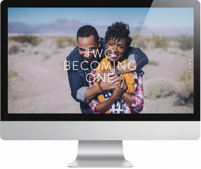
Beautiful Minimal Designs: Most wedding websites you’ll find online these days are very… very (aka lots of design features). But if your aesthetic leans a little more modern, and maybe you want to show off some awesome pictures of you and your partner, then Squarespace is what you’re looking for. Their wedding website templates are super customizable. They are all focused on showcasing what makes you awesome, and then delivering the important information in a way your guests can actually read. Also, all of their templates are desktop AND mobile friendly automatically, so if when your guests are looking up the address in the car, it won’t be an issue.
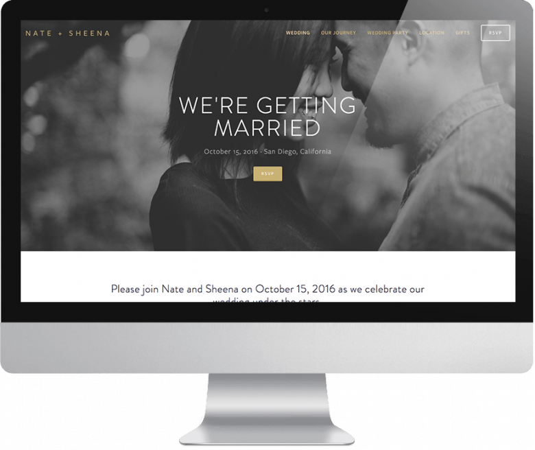
A URL you can actually read: Here’s a story I don’t get to tell often enough: a friend recently set up her wedding website with Squarespace, which means that with her annual plan (just $12 per month), she got a personalized domain name (you can pick from either .com or .wedding). So she made the URL her first name and her partner’s name dot com. When I went to go check it out, I didn’t even have to reference the text message she sent me, because you know what I can remember? My BFF’s name and the awesome lady she’s going to marry. Because normally? Nothing ensures I will forget how to find your wedding website faster than a URL that looks like this: thebigweddingwebsite.com/maddieandmichael/wearegettingmarried.

Registry Integration (at last!): Just when I start to think wedding technology is getting a little better, I find myself at a friend’s (non-Squarespace) wedding website, trying to figure out why I have to navigate six different tabs just to read their damn registry. But as of this year, Squarespace is taking at least that annoyance out of the equation. You can now integrate your Zola registry directly into your Squarespace wedding website, and your guests can browse and shop without ever having to leave the page. And we all know that the fewer pages your family has to navigate, the lower your chances are that they go rogue and say screw it to the registry altogether and get you that adorable set of coasters you’ve always (not) wanted.

A little help from your friends: While Squarespace makes it easy for you to change fonts, backgrounds, and everything in between, they also understand that most of us are not professional designers. Which is why they have a bunch of #lazygirl tools and support at your disposal for amping up your website. For starters, you can take advantage of their free logo maker to create a quick and easy header for your wedding website. Or if you’re struggling to find pictures you like of you and your partner, Squarespace has a deal with Getty Images that lets you browse their gigantic library of photos to find stock images that work with your website (each picture is just $10 to use).
 Plus stuff that’s just plain helpful: Squarespace might be known for their looks (seriously, the templates are A+), but where they really excel is in functional features that actually make it easier for people to find out info about your wedding. Because that is the point of a wedding website after all, right? For example, there’s a Google Maps integration to make it easier for your guests to find your venue. Plus they’ve got an easy-to-use form to collect addresses for invitations or gather your RSVPs. Squarespace even has an Instagram integration that lets you automatically pull in images from your wedding hashtag. #winning
So if you’re looking for a place to set up your wedding home base, or you just want to head off any questions before they start pouring in, head over to Squarespace and set up your free wedding website trial right now. Because you def have better things to do with your time than playing wedding receptionist. Like, you know, actually planning the damn thing.
CLICK HERE TO START A FREE 14-DAY SQUARESPACE TRIAL AND MAKE YOUR WEDDING WEBSITE TODAY. APW READERS GET 10% OFF YOUR FIRST SQUARESPACE PURCHASE WHEN YOU USE THE CODE APW17 AT CHECKOUT.

This post was sponsored by Squarespace. Squarespace makes beautiful wedding websites happen in a matter of minutes, thanks to their user-friendly software and modern, minimal template designs. Click here to start a free 14-day trial and make your wedding website today. APW readers get 10% off your first Squarespace purchase when you use the code APW17 at checkout.


