The early parts of wedding planning are always a bit of a mixed bag. On the one hand, it’s a joyful time of celebration and possibility. What kind of wedding will you have?! The choices are endless! And on the other hand, reality starts to slowly creep in. What do you mean there are only three venues in your city that have availability for 2021? (So real as 2020 weddings get rescheduled, and newly engaged folx are also on the hunt.) Wait, a bouquet costs how much? You mean everyone needs a chair?
Which is why I think one of the best ways to save your sanity during wedding planning is to have a creative project that is just for you. Maybe you want to knit a hundred beer Koozies, or hand glue a thousand crystals to your shoes (true story from a wedding I once attended). Whatever it is, the key is that it should be subject to No Outside Opinions. And one of the easiest creative projects you can do at home is to take some DIY engagement photos of yourself (seriously, stick with me), and then set up an awesome wedding website with those photos (and gifs). And as long as you make sure your guests can find the information they need to get to your wedding (in the right place, on time, dressed appropriately), the rest is all #youdoingyou.
But maybe, just maybe you don’t spend your workdays trying to get a cool-looking photo… and for that part, you’re not sure where to start. Well, that’s where we come in, with some pro-tips and ideas (and obviously confetti).
The good news is, these days you can actually get damn good photos on your phone, and even edit them right there. And the even better news is, that’s kind of all you have to do. Once you’ve got your DIY engagement photos done, you’ll just upload them to your Squarespace wedding website. Their designer templates are gorgeous straight out of the box, and we’ve got tons of tutorials making it super easy to personalize your wedding website without having to have a degree in design or HTML. And voila, instant gratification. So if you’re looking for fun, but #lazygirl ways to make your wedding website 💯, here are my best APW secrets for getting cool DIY engagement photos that don’t require any special skills or tools, other than maybe a trip to your local party store.
How To Get Cool Photos with zero(ish) dollars
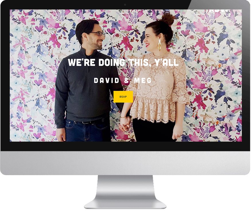
Squarespace’s wedding website templates are designed to show off big beautiful photos. Which is great! Your wedding is celebrating the union of you and your partner. Your faces are kind of important. And if you’re getting professional engagement photos taken, your wedding website is an awesome place to use those images. But the timing of engagement photos isn’t always going to line up with the timing of setting up your wedding website (and heck, in this COVID version of life, getting professional pictures may just not be a choice). So unless you’ve got an on-call pro photographer in your back pocket, coming up with that great photo can feel intimidating. Take it from the person who would only have selfies on her phone if her job didn’t require the occasional photoshoot. But here’s the thing: your cell phone is actually better equipped to take photos than my first DSLR. So grab a friend (or a selfie stick, or one of those cool cell phone tripods) and go create some DIY engagement photos. These are my favorite photo hacks, which we use all the time at APW:
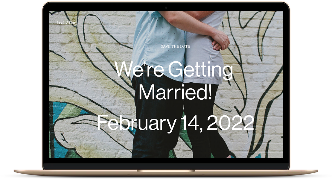
Find a great wall: Feeling a little camera shy? Let your background do the talking for you. Is there an awesome mural in your city? A colorful wall somewhere? Some great wallpaper in your building? Stand in front of it and do your thing.
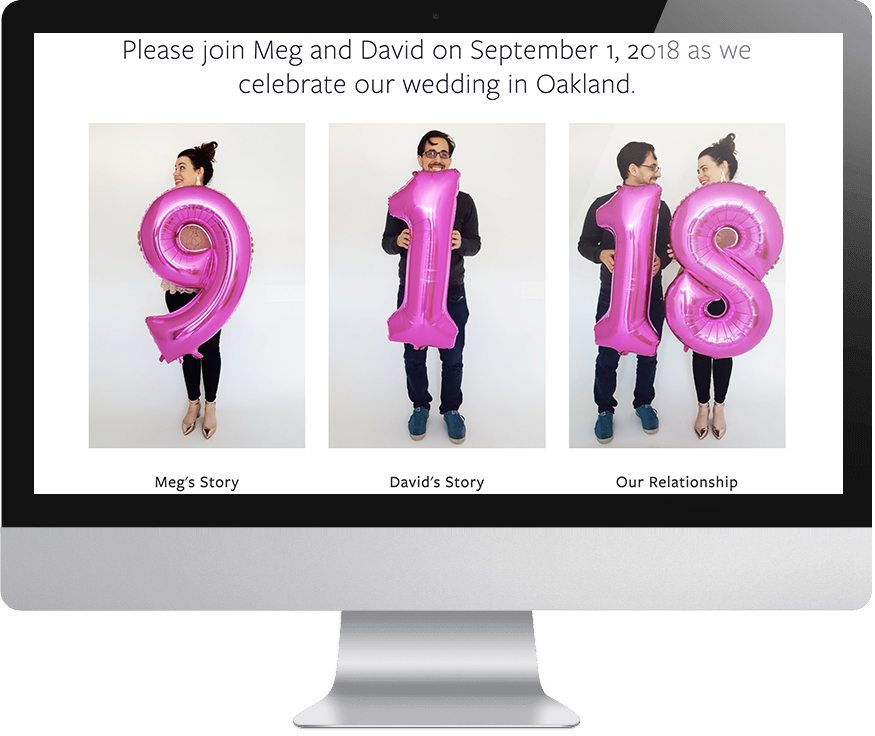
Use a statement prop: It can be super awkward to get in front of the camera if you aren’t used to it. So if you need a distraction, give your hands something to do. We’ve all seen adorable engagement photos with signs spelling out “Save the date” or a mug that says “does this ring make me look engaged?”. Honestly, a prop in your hands will absolutely make everything instantly less awkward and maybe get your fiance to do a real laugh. One of my favorite props is giant letter balloons. They’re only ten bucks, and if you hold them in your hands, you don’t even need helium. Or get yourself to the Target dollar section or Etsy and find some cute things to hold on to.
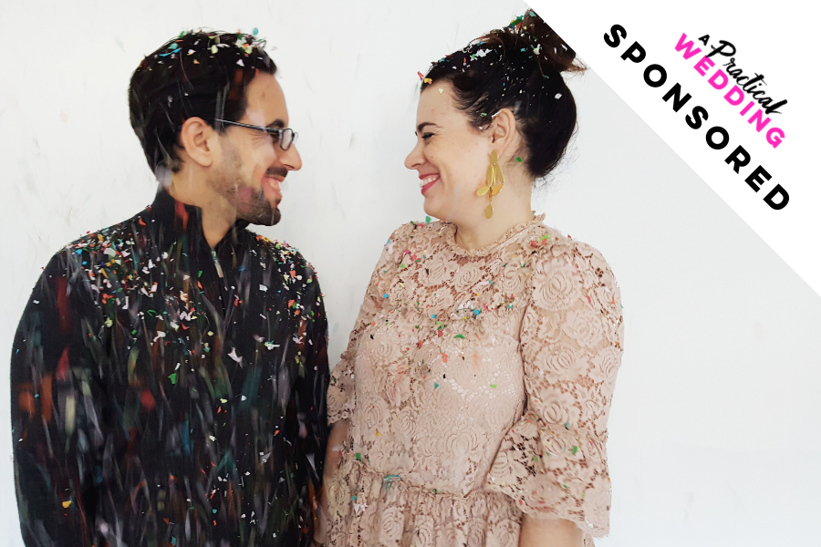
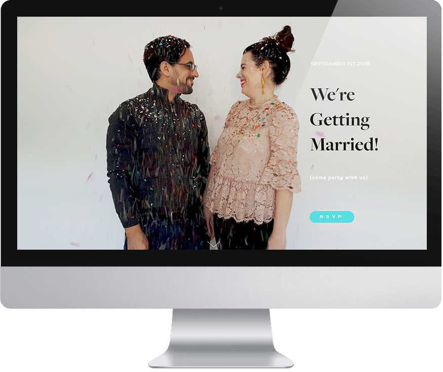
When in doubt, confetti: Confetti is cheap, and it makes your photos look like a party. If you have a helper to throw confetti at you, my favorite kind is Flutter Fetti because it falls to the floor more slowly. (But buyer beware: we learned years ago during an APW shoot not to fling Flutter Fetti too hard, lest you accidentally injure yourself or someone else. But that’s a story for another day.) But if you only have your own two hands, you can just buy it loose like this.
Pro phone-ography tips: Photography with our phones has become the norm. Even for those of us who own and love to shoot with a big fancy DSLR camera, we often go for convenience. And what’s more convenient than all of our phone cameras with us all the time? Of course, any phone works, but if you feel like your phone is older or doesn’t shoot with great quality, ask a friend if you can borrow theirs (we find that the newer iPhones are the best in the biz for top-quality pictures.) As you shoot your DIY engagement photos, here are a few things to think about:
- Orientation: Make sure to shoot some photos vertical and some horizontal so you have options when you sit down to upload them to your Squarespace template.
- Exposure: On an iPhone, you can tap the screen as you’re taking a photo and a little square with a sun next to it will pop up, slide that sun up and you’ll increase the exposure making for a lighter brighter photo.
- Focus: You can also choose which part of the photo you want to focus on by tapping that part of the screen. If you push the screen a little harder, it will lock in the focus on that part of the image (hint: this should be your faces in most cases).
- Self-Timer: If you’re truly DIYing your engagement photos, and don’t have a friend who can help out, you’ll definitely want to utilize your self-timer. On iPhones, you’ll just tap the clock icon at the top and select “10s” which should give you time to run into the frame.
- Gear: If you can’t work with a pro-photographer, you might decide it’s worth putting a little bit of money into the process. Consider a tripod and a remote shutter (to cut back on the running back and forth).
There are two other main secrets to taking your photos from okay to awesome: good light and good editing. For lighting, if you’re taking pictures outdoors, look for open shade (as in: not the dappled light under a tree, but the shade of a building or cloud cover), or do it in the hour before sunset during what photographers call “golden hour.” Inside? Turn off all your overhead lights and hang out near a window during the middle of the day when the sunlight is streaming in (turn your faces toward that window light to catch the softest looking skin you can).
We asked a pro-photographer friend of APW, Julie Pepin, to share her best advice. Here’s what she had to say:
The number one piece of advice I can give is to pay attention to the lighting. In most cases direct sunlight is not your friend. Sure you may love a sunny cloudless day in real life, but for photos – shade is what you are looking for. Shade evens the light out and won’t cast hard shadows on different parts of the photo. A cloudy day in photos does not look like doom and gloom, it actually can end up looking a lot brighter and more appealing than it’s sunny counterpart. It’s the simplest way to improve a photo if you aren’t a professional.
For editing, I recommend using one of the following apps: A Color Story, VSCO, or the free Adobe Lightroom mobile. If you decide on Lightroom, it’s pretty easy to search for presets from photographers on the internet that will truly take your iPhone photos to the next level. VSCO and A Color Story both have great filters that will make your colors pop and your skin look all glowy. And then if you need to tweak anything once you’ve already uploaded them to your Squarespace website, you can actually use Squarespace’s built-in photo editor for other basic adjustments like cropping and brightening. (And, don’t forget to adjust the focal point on your photo so that Squarespace shows off your best parts.)
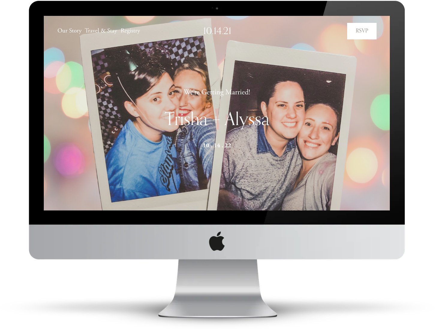
Don’t Call It A Comeback: Julie also gave us another fun suggestion that we think you should definitely try:
Have some fun with it and go purchase a disposable camera to get some old fashioned classic film looking pictures. The things that make these kinds of film photos so beautiful to me are the things that some might think of as ‘mistakes’—so really you don’t need a professional for this, try not to overthink it. Think candid 35mm moments from back in the day and if you grew up in the 80’s, 90’s, early 00’s you know what I’m talking about. ;)
Most anywhere you take your disposable camera to be developed will be able to scan the images and make them digital for you, so you can upload them right to your Squarespace site in all their ‘vintage’ glory. Or, you could even snap a photo of your favorite Instax, Polaroid, or photobooth strips and use that as a featured image on your wedding website!
Say it with video
The Squarespace feature that I am most excited about is that you can include video backgrounds on your wedding website. While I am usually too intimidated by the technology of trying to make actual videos, there’s one kind of video I am not afraid of and that’s Boomerang (here for Android.). If you don’t already have it on your phone, Boomerang creates quick video loops that are super fun and require zero technical skills. Or you use your phone’s actual video capture and give your wedding website some serious Harry Potter moving picture vibes. (Oh, and Squarespace supports gifs on your website, too!) So, as you take those DIY engagement photos, take a few videos, too—why not?
Do it for the gram
It’s also super easy to pull in photos you already love from your Instagram. Heck, you could make an Instagram just for this purpose with all your favorite photos through time, then add it as an Instagram block to your website so that your guests can browse through all those years of social media lovin’.
(Lo)Go Crazy
If having your face all over your wedding website isn’t your idea of a good time a) I don’t know you, and b) just kidding, it’s cool, you can say it with words instead! Skip the DIY engagement photos, and hop right over to Squarespace’s user-friendly logo maker that is totally free. You can play around with text, or choose one of their icons for a simple and impactful landing page. Squarespace also has built-in charts, so you could spend an afternoon making cheeky graphics for various details like day-of activities, and how much fun your guests can expect to have come wedding day:

Feel like going above and beyond? You don’t have to have a working knowledge of Photoshop to make cool word art. You just need your phone (again) and some old school art skills. Cut out magazine letters, gather up some swag, or raid your niece’s block collection, and layout your names and wedding date on a clean surface. Take a picture, and you’ve got an insta-logo that will have just the right amount of DIY flare. (We also love Canva around here for making easy, fun graphics that you can save to your computer and upload to your website.)
Pro-tip: It helps to pick your Squarespace template before you take any pictures or make graphics, and pay attention to where your logos and menus are. But don’t worry if the layout isn’t perfect on your first try. Squarespace makes it easy to move around logos and buttons with a simple drag of your mouse. And bonus: all Squarespace templates can be customized into wedding websites. So don’t feel like you have to stick to the wedding templates (though they honestly are 🔥🔥🔥).
So if you’re feeling uninspired by the early parts of wedding planning, or are feeling trapped by the stuck-ness that 2020 is giving us all, and if you need a creative project that you can do from your couch while catching up on season six of Schitt’s Creek, go sign up for a free 14-day trial with Squarespace and have some fun. Squarespace will take care of the rest of the work, like making sure your website looks awesome on mobile screens (included with all their templates), and that your URL is something even your seven-year-old nephew can read (custom URLs are included with all paid subscriptions).
Have you created your wedding website yet? Share your URL in the comments! If not, get 10% off your first Squarespace purchase when you use the code APW2020 today.

This post was sponsored by Squarespace. Squarespace makes beautiful wedding websites happen in a matter of minutes, thanks to their user-friendly software and modern, minimal template designs (plus tons of other legitimately helpful features). Every yearly Squarespace purchase also comes with a custom URL, and of course, their award-winning customer service (just in case you get stuck). Click here to start a free 14-day trial and make your wedding website today. APW readers get 10% off your first Squarespace purchase when you use the code APW2020 at checkout.

