We’ve been slowly forcing encouraging our whole team to make their own portfolio websites. So, when Meg came to me and said “Chelsea, it’s time to make your website” my first thought (after ugh, I knew this was coming), was whyyyyyyy me??? And to be honest with y’all, I’ve been putting this off for a long time. Like five years long time. So it’s safe to say I was overdue. But before I could even begin to make my site I realized that would require a trip down the memory lane of good jobs, bad jobs, and everything in between to find my portfolio pieces. And as we’ve discussed on APW many times, talking about yourself can be HARD. Plus, I just did not want to. I try to stay out of the limelight and keep a pretty private life despite working for an internet publication (the irony, right?), so this project is something that really pushed me out of my comfort zone.
Talking about myself is, well, hard for me. Given that my career path hasn’t necessarily run a straight line, I have struggled with a way to describe what I do without sounding like I’m all over the place. I wanted everything on my website to be cohesive and naturally amount to something meaningful and professional at the same time, while staying true to me and not sounding or looking like a robot wrote it. Not asking for much, right? Truth be told, though, I’ve done a whole lot of stuff and it’s simply not all that cohesive. So that’s why I’ve put it off for so long. I couldn’t avoid it any longer, so I did the damn thing, I made a personal website.
Organizing years (of all types) of work
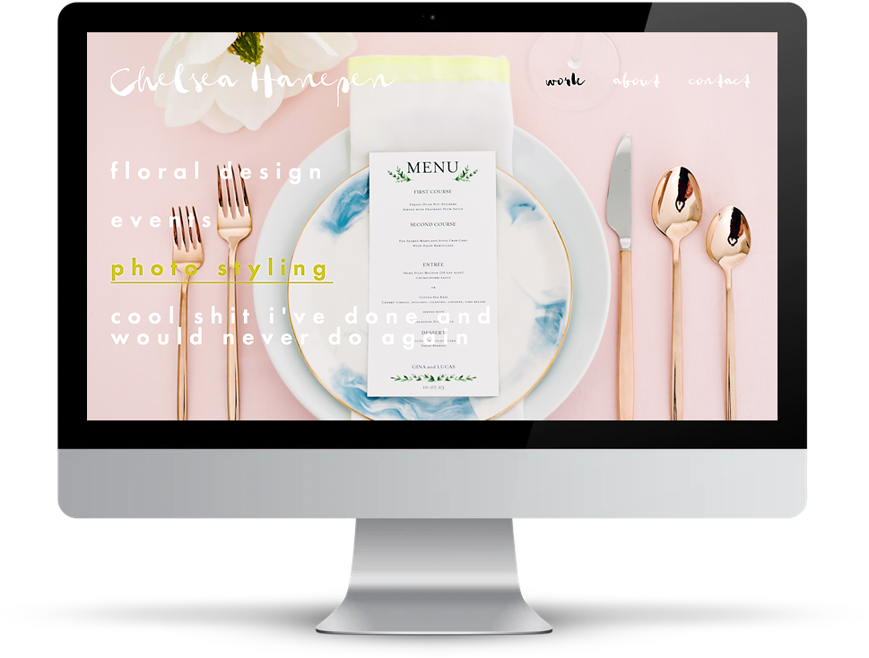
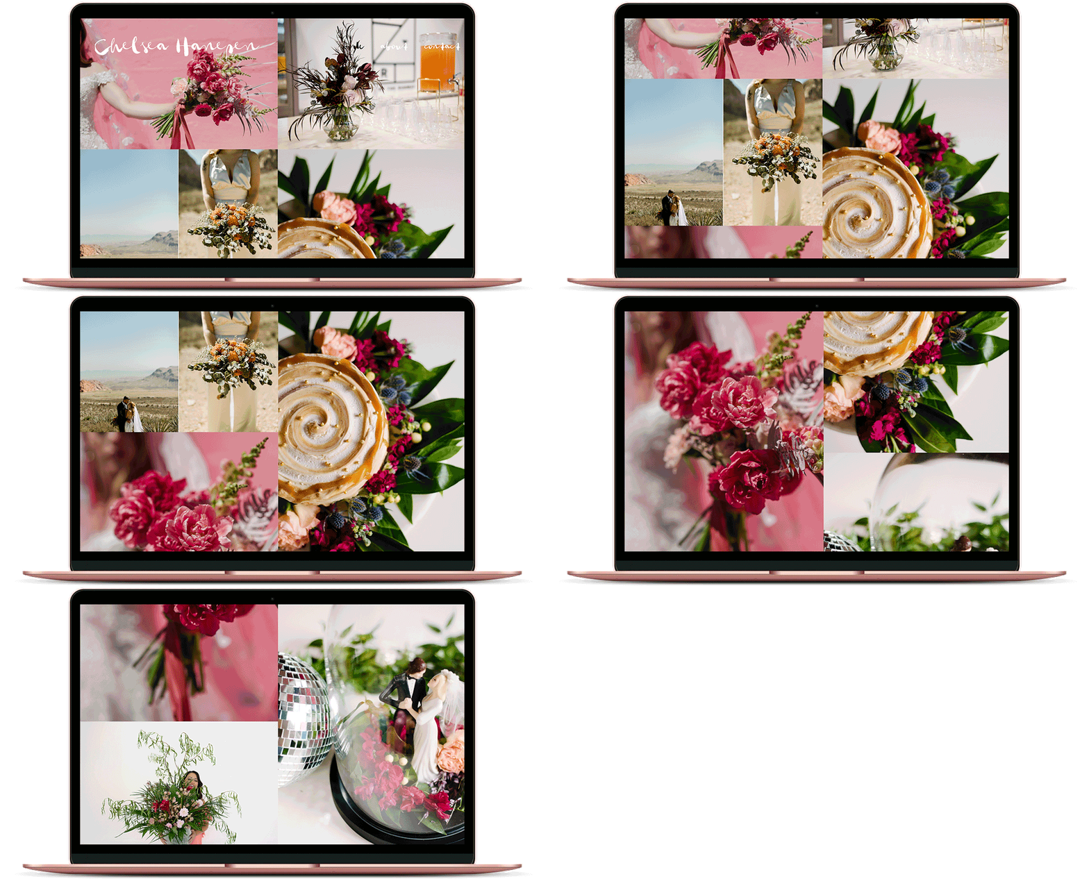
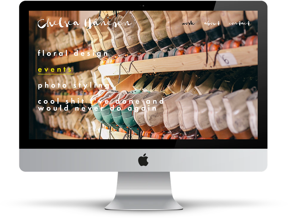
First thing I knew that I needed to do was get my sh*t together, literally. Having gone to school for graphic design and merchandise management while dabbling in a little bit of, well, everything professionally means my creative work is in different mediums all over the place. So I started off creating categories that would double as pages on my site. I was able to narrow those categories down to floral design, events, and photo styling—oh, and “cool sh*t I’ve done and would never do again” (which is arguably the most interesting, but sort of made me cringe to compile).
Once I figured out what those categories would be, I was able to take a look at the work I’ve done over the years and analyze it in a way that actually made sense. I didn’t want too much or too little, and I wanted my work (the actual things I’ve done and made and been a part of) to be easily accessible and look damn good.
Forgetting perfectionism
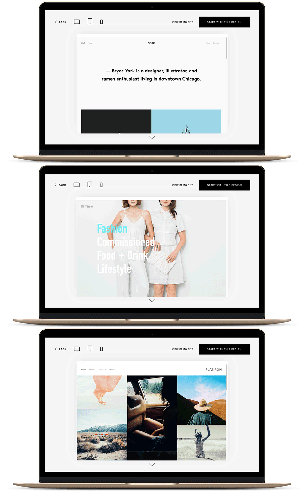
One of the hard parts about talking about myself or showing off my work is the need for me to feel like it has to be perfect before I show it to anyone. You can bet this need for perfect applied to my personal website as well. Lucky for me, Squarespace made it super easy to pick a template that looked great on the first click. After scrolling through a lot of them, and considering a few of them, I chose a front runner. But, after adding my photos, text, bio, and contact info I decided that template actually wasn’t quite right for me. At first, I had started with it purely based on aesthetics and realized very quickly that perfect (visually) isn’t the goal here—clarity is.
I needed the right template for the type of information I was trying to display and while that first template I chose was beautiful, it just wasn’t going to cut it. I tried one other, but it wasn’t exactly what I wanted either. I needed a clean and organized layout that felt like I was displaying my best work, and one that functionally made sense for the type of site I was trying to design. And guess what? All it took was one click to switch over to another template that worked for me. Ya’ll, I did not have to start all over again. Cue: sigh of relief.
Now, the fun part
Turns out, you can go one of two ways with Squarespace. Super custom or stick to the template. Both options are great (do you!), but I’m more of the former than the latter. As someone who loves options, Squarespace made me feel seen. Multiple layouts, a ton of fonts, and endless colors to choose from—they are speaking my language.
Staying true to me, I customized my template… A LOT. Switching out all the fonts and seeing changes in real-time was a lifesaver. If we’re being honest, I clicked through just about every font they had to offer. I mean, with so many to choose from, how could I not? Once I finally decided on a display font and a font for the body text, I could see my overall aesthetic really coming together. My site was starting to look like the REAL DEAL, or you know, something I would be proud to show off to my nearest and dearest (or the internet peeps I would normally hide from—that’s you all, sorry).
Things I didn’t know I could do
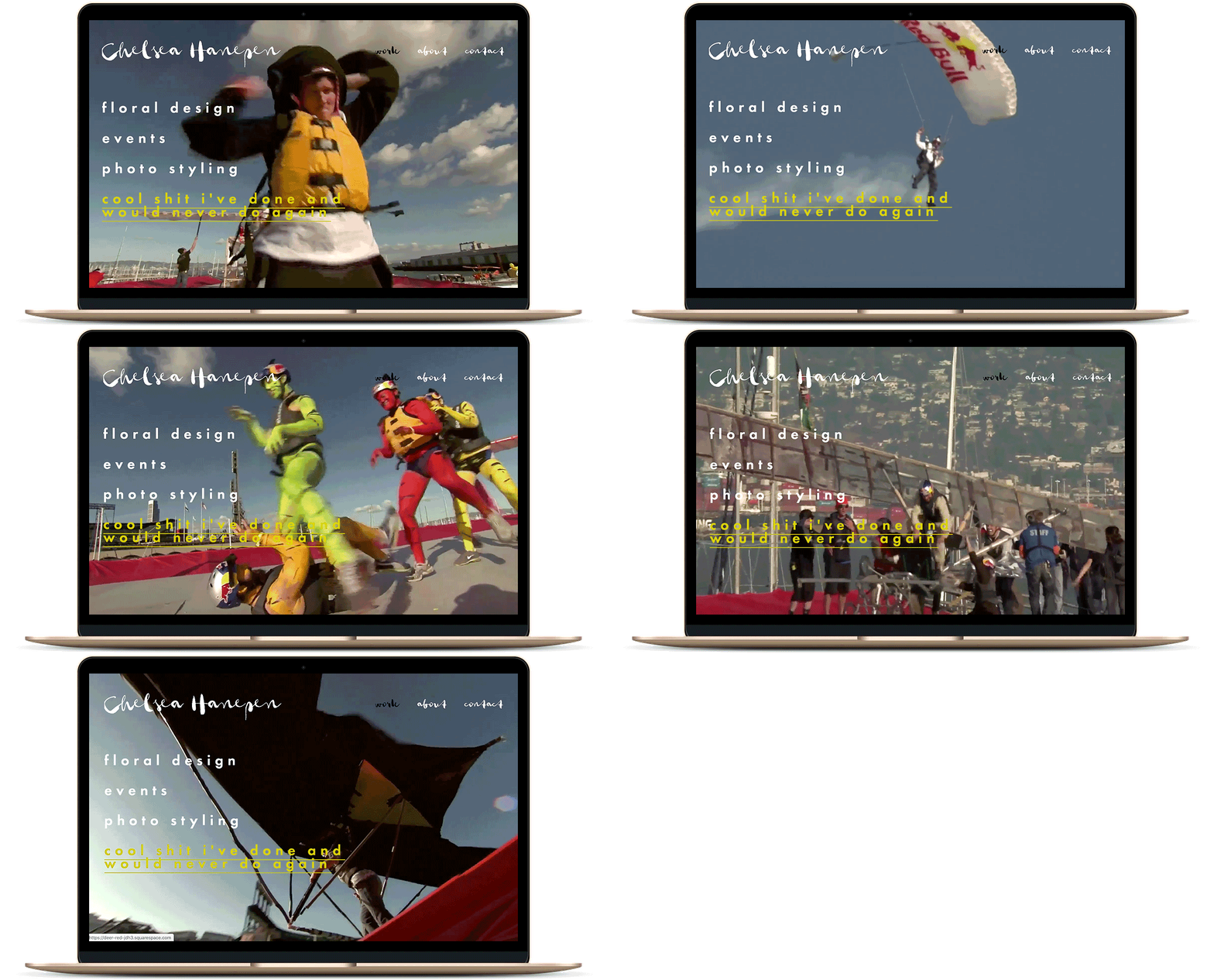
Squarespace has a ton of capabilities, and I thought after seeing everyone on staff’s website (see: Meg’s, Dana’s, former staffer Najva’s, and the APW Studio site) I had a handle on all of it. I guess I didn’t (because Squarespace does it all). You know how I mentioned the “cool sh*t I’ve done and would never do again” section? Well, one of those cool things I did was create a flying craft for Red Bull’s Flugtag in San Francisco. When I tell most people that, they give me a crazy “WTF are you talking about” look. More often than not, I end up going through the depths of YouTube to find video proof of what exactly it is I participated in. (For those of you that don’t know… me and my team of “professionals” aka my roommates and their dad, created a 20-foot-long flying hot sauce bottle in an attempt to break the record for longest flying distance in the competition. SPOILER ALERT: we did not… ahem… win.)
To my delight, when you hover over that section on my home page, a video of the event will now automatically play in the background. This makes it SO EASY for me to tell people to just head over to my site and it doesn’t take forever to find that old video on YouTube anymore.
And now I (finally) have a site
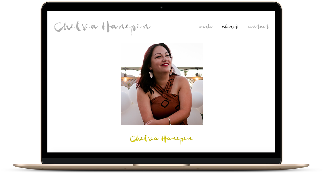
After years of putting off making my own website and, you know, having to talk about myself, it’s finally live. To be completely honest, if I hadn’t been so stubborn about doing the work, I would have made my site a long time ago. I mean, I work at APW, where we are constantly talking about how womxn need to take up more space and brag about ourselves on the internet and in life. (Don’t tell anyone, but I’m glad I finally did it.) Squarespace made it simple to make a site that 1) I am proud to show off, 2) doesn’t feel stuffy or pretentious, and 3) let my work and experience really speak for itself.
All in, I was able to build my Squarespace site in just a day’s work of time (seriously, about eight hours) and make a personal website that I truly love and can’t wait to show off. So, go look, and come back and let me know how much you love it.

This post was sponsored by Squarespace. We are thrilled to be continuing our partnership with Squarespace talking about what it means to be a woman with #goals in this modern world. Whether you’re stepping up in your career or striking out to do your own thing, one of the best things you can do for yourself is create a place online where you can show off your work in the form of a portfolio site, an online resume, or another hub that displays just how awesome you are. Squarespace provides an all-in-one hub (including everything from custom domains to templates, SEO tools, and now even built-in marketing tools like e-mail marketing) that makes it easy to build your online home beautifully. Never made a website before and have no idea where to start? Check out their webinars for free help and step-by-step details, or hire a designer if that’s more your speed. Click here to get your website started today with a free 14-day trial from Squarespace. APW readers get 10% off your first Squarespace purchase when you use the code APW19 at checkout.

