If you’re attempting to wedding invitation graphic design (or graphic design on anything for that matter) it’s one thing to know what you like; it’s quite another to bring the vision in your head into reality and onto paper. It’s hard for designers too, trust me. It may sound counterintuitive, but constraints are helpful when coming up with a design. The first, and most basic constraint to consider is layout, which we’ll be discussing today.
Related: Graphic Design Tools Of The Trade (And Alternatives To Photoshop!)
A visual design layout has three basic components : Visual and text elements, scale, and composition (or arrangement). Let’s look at each one of these in detail, using wedding invitations (surprise!) as examples. (I used talented APW sponsors work as examples, because why not?)
Imagery and text elements
“Form follows function” is a utilitarian phrase that comes from architecture. It means that the design of something (building, car, or a card, etc.) should be dictated by what it is being used for. You can deviate from this dictum a bit when it comes to wedding invitations, but the basic principle still holds.
The primary function of your wedding invitations is to convey information. There are also less strictly functional tasks, like setting a tone or mood and perhaps (subtly) communicating who is hosting and family relationships (more about this later).
There are two basic elements at your disposal for this fundamental communication: imagery and text. These will inform the size, format, and style of your layout.
Think about how much text and information you’ll need on a card. Are there four different family members hosting, each of whom wants their first, middle, last names, and titles on the invite? Or are you and your partner hosting people for hot dogs and potato salad at the local park? One of these layouts is going to have a lot more text than the other.
Related: Graphic Design Typography Tips For Wedding Inviations
Do you want a photograph on the invite, or will a small illustrative dingbat do the job? Getting clarity on the importance and prominence of each of these elements is a good place to start. Let’s look at some examples.
Minimal Text
The information on this charming vintage destination invitation from A Printable Press sticks to basics. There is a short intro, names, date, and location. The minimal amount of text allows for the clever use of map imagery and the couple’s names to serve as the main visual elements.

More examples of minimal text layouts on this Pinterest board.
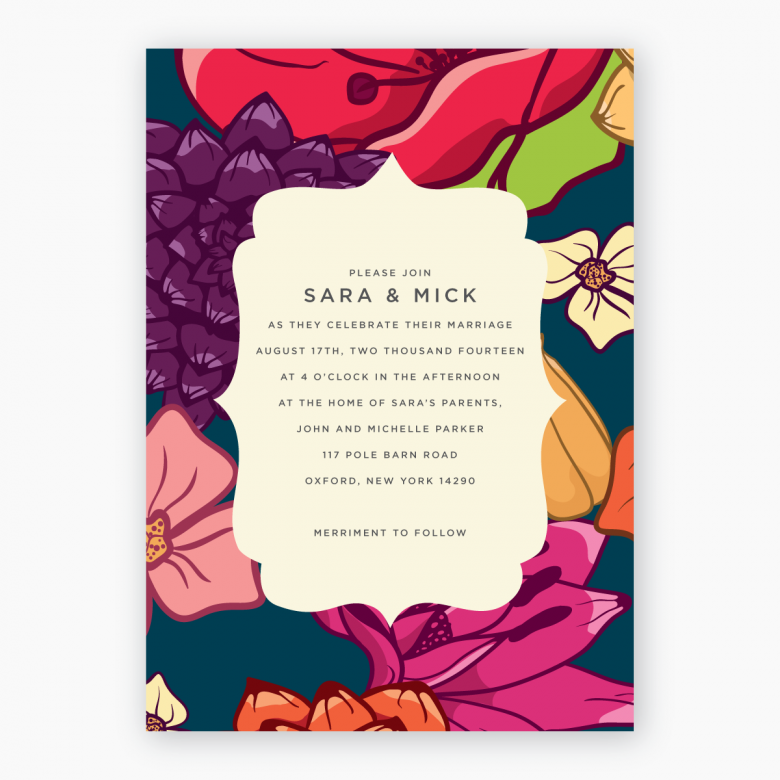
Text Heavy
This is an elegant and slightly more formal invitation from Up Up Creative. By using a smallish monogram and simple visual element (the skeleton key) the invite allows for a substantial amount of text without getting too busy or crowded:

More examples of text heavy layouts on Pinterest here.
Photography

Okay this isn’t a wedding invitation, but it could be. This card from Up Up Creative uses a photograph as the all-encompassing element. There’s enough space below the main focus of the image to allow for a small amount of text. When using photography in a layout consider two things:
1. If the image is a full background element, the photo shouldn’t fight with the text, there should be some non-busy area of the photograph where the text can be displayed comfortably and is easy to read.
2. If the photograph is not used as a background element, make sure that it is tightly cropped and works well in a smaller format to allow room for text.
More examples of photo layouts on this Pinterest board.
Related: Sourcing Your Wedding Invitation Artwork
A word of warning: When perusing photo-based designs you’ll see a lot of lush, gorgeous photo invitations. These cards are only as good as the photography! A great layout can’t save a badly lit, poorly composed image. Just sayin’.
Wedding InVitation Graphic Design: Scale
Once you know how much imagery and text you’ve got, the next thing to consider is scale—how these elements work with one another and which ones take prominence. The scale and contrast of elements does a lot to convey certain moods.
Go big or go home
If your design were a song would it be Bjork’s “Violently Happy”? Then pick an element (text or photo) and make it big, Big, BIG.
That’s what I did with my Love, Joy, Happiness design. A phrase set in unapologetically large type takes center stage and indicates that this is probably not going to be a formal, understated affair:

More examples of full-throttle, large-scale style designs over here on Pinterest.
Formal Wedding Inviations
On the other hand, a formal, understated affair may be more your speed, keeping both typography and visual elements in relative proportion to each other will do a good job of communicating this. This classy Classic Calligraphy invitation from A Printable Press shows how it’s done:

Note the variation in the style and size of the text; they aren’t dramatic. The sole visual elements are the flourish-y but restrained border and ornamental dingbats which serve to support the text rather than act as a main element.
More examples of elegant, understated, or minimalist layouts here.
Striking a balance
There is a middle road as well. In this case one element like the sea star in this wedding invite from A Printable Press serves as a visual anchor, allowing room for the text to take center stage, without being the primary graphic element:

More examples of middle-of-the-road, balanced layouts on Pinterest right here.
The main thing is to prevent elements from competing with one another so the eye is drawn to the most important aspects of the design.
Arrangement and Composition
The possibilities are endless when it comes to arranging elements of a design. An excellent resource for this is the Graphic Design Cookbook. Whenever I’m stuck on an approach, a quick flip through this little book will usually get my design juices flowing again.
The three to four most basic design compositions are bordered, borderless, full bleed, and partial bleed. These are pretty self-explanatory, let’s take a look:
Borders
Bordered designs, well, have a border. Kimi at a Printable Press has many bordered designs that work beautifully. Here’s a recent one:

The floral border color and size makes it a striking visual element on the card, but as it surrounds the text, that is ultimately where your eye is directed.
A key consideration with a border is to make sure there’s sufficient space between the border and the text, and the border and the actual physical border of the card.
More bordered designs right over here.
Borderless
You guessed it! Designs without a border like this one from yours truly:

Actually, borderless designs do contain a border; the amount of negative (empty) space between the visual and text elements and the physical edge of the card. Allow at least a quarter inch of space to keep the design from looking too crammed.
Let it Bleed
A full bleed is when an element of the design (usually visual) expands beyond the edge of the page or card, like on this stunning design from Up Up Creative:
More examples of full-bleed designs on Pinterest right here.
A partial bleed is when an element expands beyond online to three edges, like the bottom border element on this invitation from Up Up Creative:

Check out more examples of partial bleed designs right here.
Production is the main thing to keep in mind when working with bleeds. If you’re printing designs at home it can be hard to print bleeds on pre-cut cards. I have a printer that is otherwise great, but despite endless futzing, I still can’t get it’s bleed (borderless) function to work.
Please don’t misunderstand; you can easily print full bleed designs on your own, you’ll just have to trim each one out on all four edges. If you were hoping to avoid this task, choose or create a design without bleeds.
Key take-aways for creating a layout:
1. Think about how much text and imagery you want/need first.
2. Visual and text elements should contrast one another, or support each other without fighting for prominence.
3. Designs with a border should leave a comfortable amount of space between the border and the text, as well as the border element and the edge of the actual card.
4. Designs without a border should have an ‘invisible border’ of at least a quarter inch of space around the physical edge of the card.
5. Give some thought beforehand about your production method for designs with bleeds.
Now, go forth and lay out!