Understanding layout? Check. Tools of the trade? Check.
Now it’s time for the fun stuff, typography! Volumes upon volumes have been written on typography, and never before has the general public been so well versed in it. One quick scroll through my Pinterest feed shows me that there are tons of people obsessed with it. So lets dig in, and start with a few definitions.
Typefaces/ Fonts: If you want to get technical about it, the term we use for typefaces—‘fonts’—is really a misnomer. A font is the complete character set of a particular typeface, not the typeface (Helvetica, Bodoni, Gill Sans, etc.) itself. However ‘font’ is so widely used to describe typefaces, the terms are pretty much interchangeable at this point, but at least you’re now in the know.
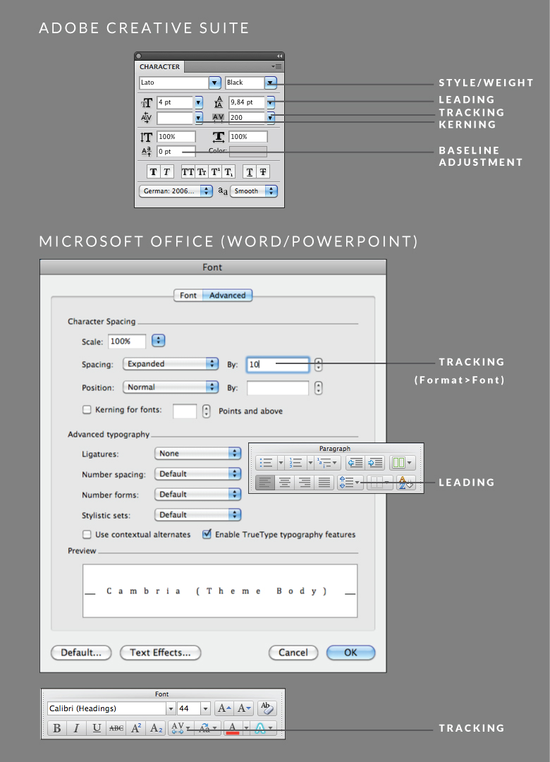
Leading: Is the space between each line of text, measured from baseline to baseline of each character.
Letter-spacing or tracking: Refers to increase or decrease of distributed space between letters and words within a line or paragraph of text.
Kerning: Is the individual spacing between characters of a single word.
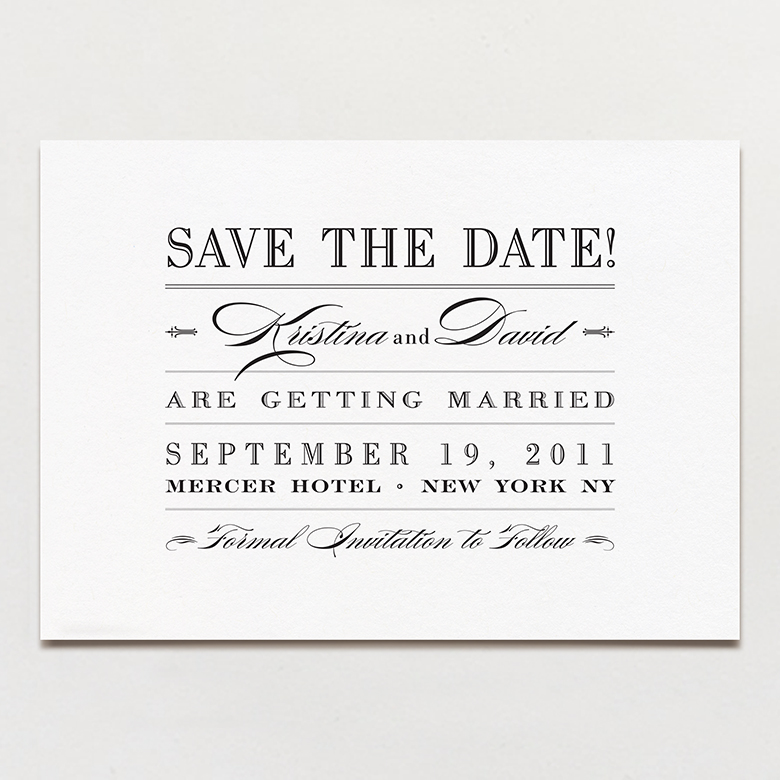
Flush left, flush right, centered, and justified text: You’re probably familiar with most of these terms. Flush left/right is when the text starts evenly along the same left of right edge. Centered text is not aligned to either the left or right margin; leaving an even space from the margin on each side of the line. Justified text is when the first and last letters of a line of text are aligned to both the right and left edges. Like this save the date from Printable Press.
Orphans: A single word that falls at the end of a paragraph (you want to avoid this.)
Type Styles and weights: You know these; a style is either Italic, bold or Roman (regular) and weights can range from light, to medium, to regular to bold or black depending on the font. Avoid using the program settings for bold or italic, but rather use typefaces that include multiple styles and weights in the font. This separates the amateurs from the pros.
Font Family: The major typeface families include, serif, sans-serif, script and display to name a few.
Here’s a little diagram that covers some of the major palettes for type setting in some of the tools we discussed.
Working with type
Start by picking a typeface or typefaces. Keep in mind the kind of imagery and layout you’re using and test out different looks to see if everything hangs together. There should be a nice interplay between any visual elements and the typography itself.
Some general guidelines
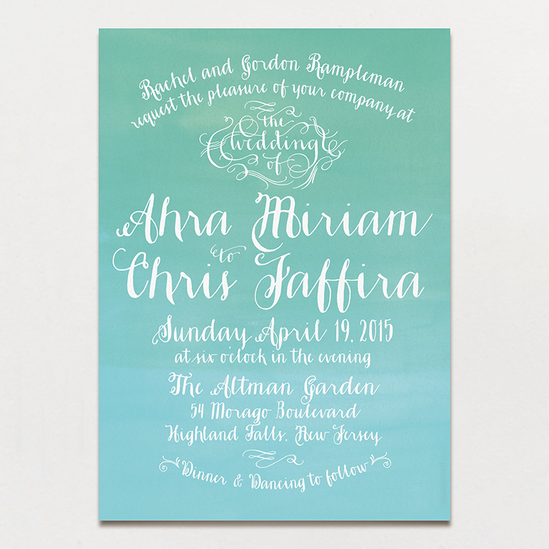
Script fonts invoke a romantic feel. The type along with nothing more than a subtle, textured background create an ethereal mood on this Printable Press wedding invite.
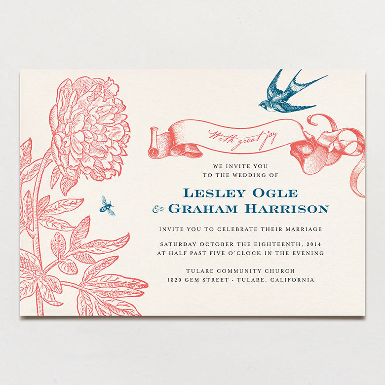
Serif fonts work for classic designs. The imagery on this invite keeps it on the romantic side, but the serif typeface adds a touch of classic formality.
For a modern look, work with sans serif typefaces. This design from my shop is entirely typography based and that, along with the use of only sans serif type gives it a strictly modern feel.
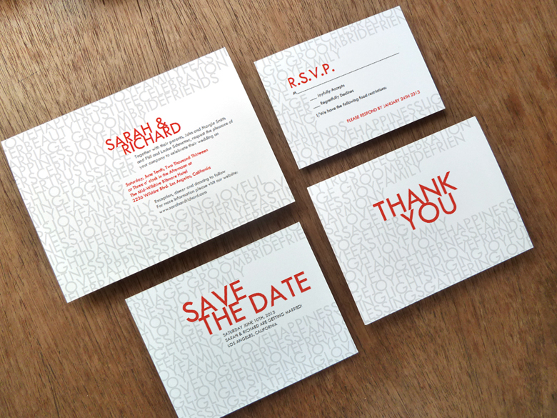
Display fonts are great for the ‘Go Big or Go Home’ designs we talked about earlier. This design from Up Up Creative, while minimal in it’s layout, uses a display font as the main visual element in the background.
For more font examples, check out this ‘Font Fun’ Pinterest board.
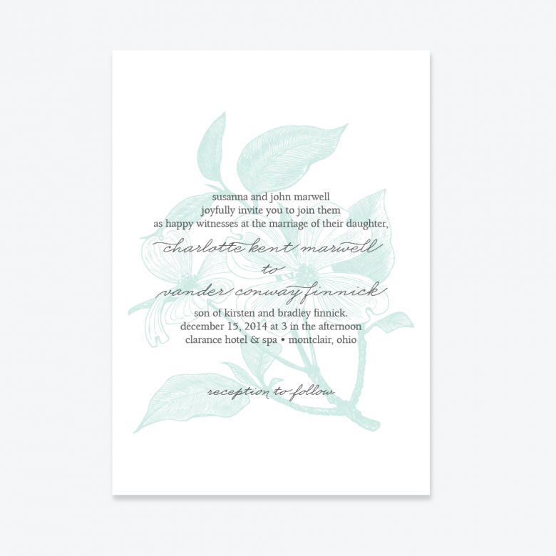
Try not to use more than two or three different typefaces in a design. Type pairing is an art, but a guideline is to go with contrast; pair a script font with a serif like in this Up Up Creative wedding invite.
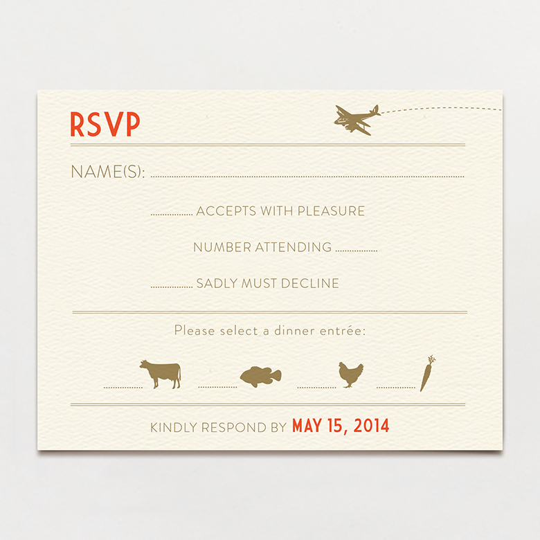
Or contrast weights, in the case of this RSVP card, bold and light weights of the same or similar typeface add some punch.
As with layout, experiment with contrast between sizes of typographic elements, and styles of typefaces.
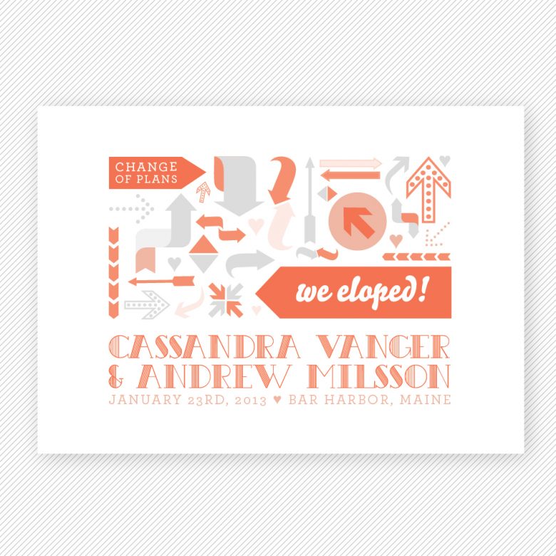
Kerning is important. For big typographic elements, like names on an invitation, you don’t want uneven spaces between the letters. A typography teacher once told me to imagine I was pouring a glass with the same amount of water between each letter in a word when kerning the letters. The letters may not be mathematically exact when spaced apart from each other, but need to appear so to the eye. The names in this Up Up Creative elopement announcement are a good example of well kerned text.
See the resource section at the end of this post for tools that will help you learn to kern (hey!).
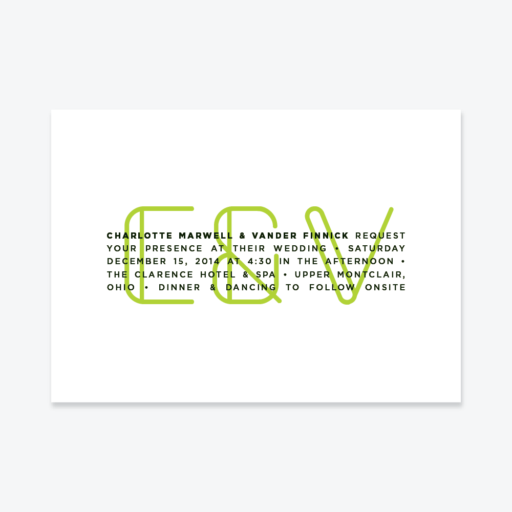
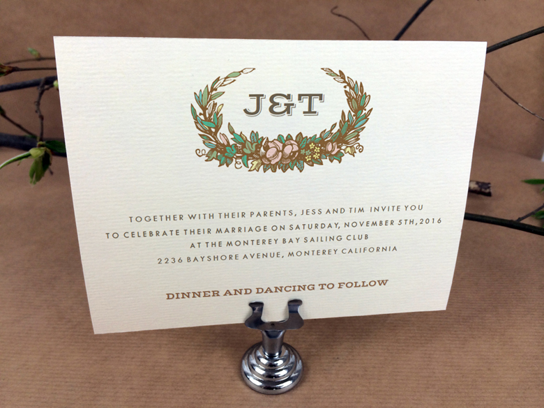
When using all caps, increase your letter spacing/ tracking. All caps can be overwhelming and hard to read; spacing out the letters both increases the ‘class’ factor and keeps the text easier to read, the main text on this invite below illustrates.
Resources
There are a more resources than ever before both for fonts and to educate yourself on typography like a pro. Below are links to some great places to start.
Free fonts: A word about free fonts: free fonts abound, but like all things in life, you get what you pay for. Properly drawn fonts have built in kerning and usually contain extra glyphs and characters, which is important if your design has non-English characters (ñ,ü,ß, etc.)–free fonts often don’t. Try out all your text before you print the first item. That said, here are some of my favorites.
- Font Squirrel
- The League of Moveable Type: These are high-quality typefaces created by professionals, but often missing international characters
- Lost Type Co-op: Great fonts, which you can download for free, but a donation is requested.
- Da Font
Google ‘free fonts’ and you’ll find tons more.
Premium Fonts: Here are some good places to go if you’re willing to part with some cash for higher quality, more characters and/or in some cases typeface weights and styles.
Typography 101 Pinterest board: A board full of cheat sheets, crib notes and other typographic goodies.
Kerntype: A super awesome (and free) online kerning game that will really give you a feel for how to kern type.
Ragtime: If you need to get good at properly setting large amounts of type (a ceremony program, for example) this game will teach you how. Mute your computer if you get stressed out easily (It’s a great game but the music made me crazy).
Fonts.com: Fontology section. If you want to really geek out, Fontology offers four detailed levels of learning, covering type history to modern digital typography. All for free!
The First Steps of Hand Lettering Class from Mary Kate McDevitt: Hand lettering is hot right now. Hand lettering is an art the sits somewhere between typography and illustration. This $20 Skillshare class will teach you the basics so you can create a one of a kind hand-drawn lettering image for totally badass wedding stationery.
Have fun, and happy lettering.

