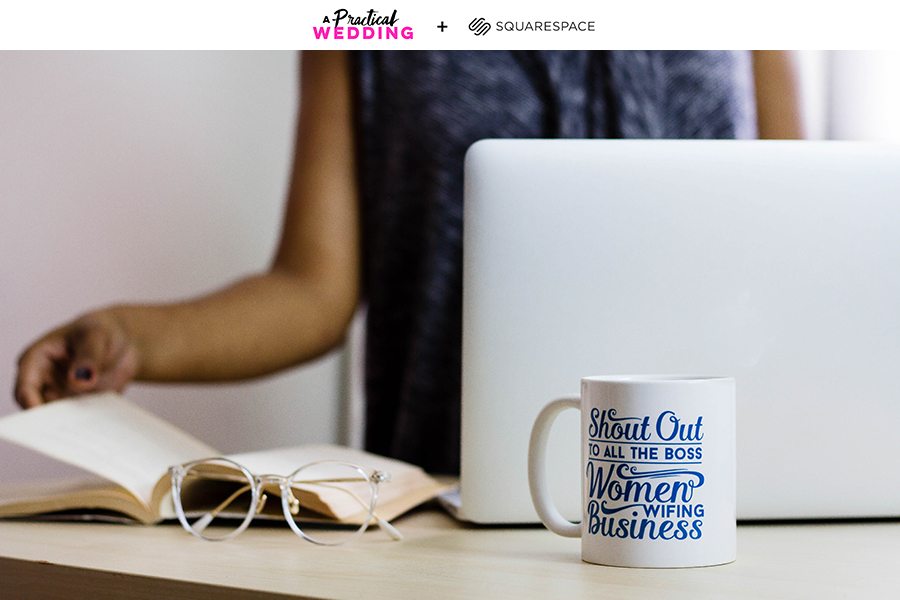
I work with enough badass women in my day-to-day life to recognize that even the brightest, most capable, brilliant humans aren’t always great at promoting themselves. We don’t want to seem too braggy, too sure of ourselves. Because what if no one else thinks our work is brilliant? Which is one of the primary reasons I’m always telling you that you should have a professional website. I mean yes, it’s a good idea to create a home online that isn’t Facebook or LinkedIn, where you can make yourself available to the universe for new and exciting professional opportunities. But it’s also just good practice to start getting in the habit of talking yourself up. If you don’t believe your own hype, no one else will.
But whenever we propose the idea that it’s a good idea to have a professional website, we get the same feedback: I don’t have any creative work to show off, so what the hell is my website supposed to look like? And y’all, I hear that. I’m pretty sure APW’s readership leans 90 percent grad students and teachers and maybe 10 percent potpourri (abstract artists, designers, restauranteurs, you name it). Which is why today we’ve partnered up with Squarespace to share some of our tips and tricks for creating an online portfolio when you’re not in a creative field.
Don’t overcomplicate it
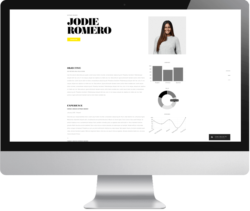
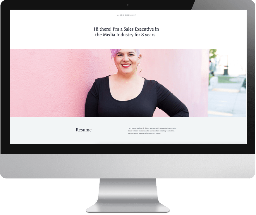
Before you get started, think about why you want to create a portfolio or resume site. Is it to give prospective employers something to click on when they Google you for a job interview? Do you want more control over your professional narrative than LinkedIn offers? Do you want to show that you can be creative in an otherwise less creative field? Your motivation should drive your approach to your website. For example, if you just want an online resume, there’s no reason to build out a twelve-page website for that. Use one of Squarespace’s cover page templates and create a simple landing page with your name and resume highlights (I really like the bold text of this one). Squarespace has some great tips for formatting a resume so that it looks nice and is more likely to show up in search results for your industry.
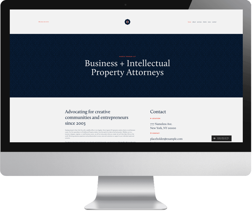
But if you’re creating a website because you want something a little more robust that feels creative, looks nice, but doesn’t require a lot of imagery, I recommend starting with a template like this one. It uses text in a way that feels design-y, and it has a built-in resume page (and if you’re looking for a template that uses no pictures at all, this one is my pick). And if you haven’t used Squarespace before, one of the single best things about their platform is that they make it really easy (and free!) to swap out templates if your first pick isn’t working out. So don’t be afraid to try a handful until you get one that feels easy and intuitive to customize. Because, pro-tip: The best template is the one you won’t abandon in a fit of rage halfway through.
Picture the alternative
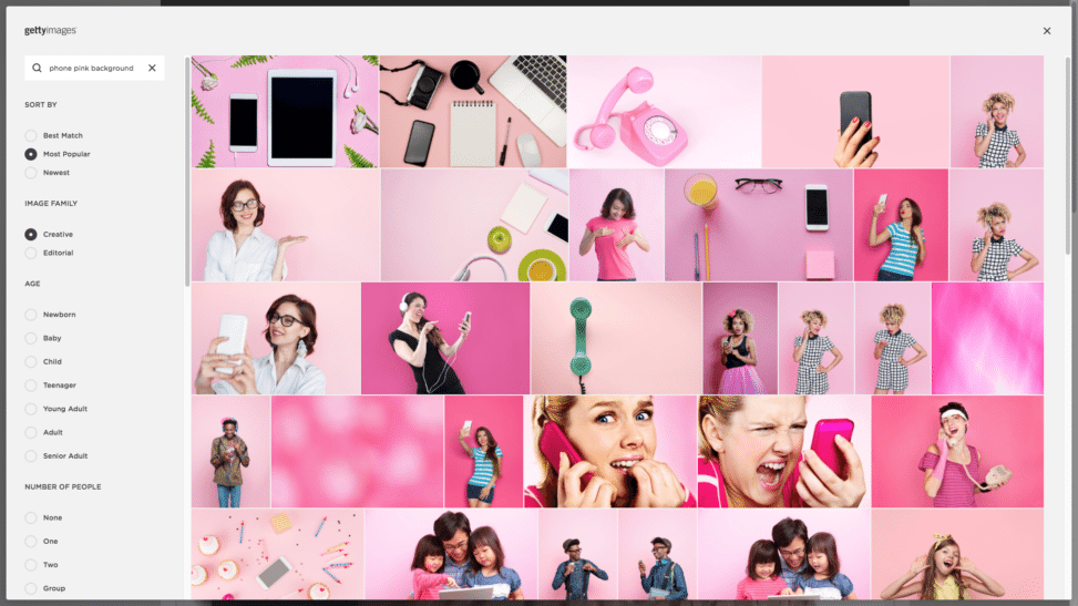
Part of the reason Squarespace’s designer templates are great for creatives is because they make it easy to show off big, beautiful photos of your work. (If you’re a photographer or designer or artist, you should seriously check them out.) But if your work leans more in the direction of say, words or accomplishments or office/lab life, that doesn’t mean you can’t still represent yourself visually. Squarespace has a deal with Getty Images that makes it super easy to find stock photos of pretty much anything, and each photo only costs $10 to use with a Squarespace subscription. If you’re a student or scientist or service professional, there are hundreds of images that can represent your work, and since Getty Images is basically the mother ship of stock photos, they are all beautiful and professional with diverse subjects. (So you can search for really specific combinations like “woman holding cell phone on pink background” and get a whole bunch of… women holding cell phones on a pink background.)
Put your best face forward
If you do have a little bit of budget to put toward your website, the best way to spend it is on a great photo of yourself. A decent headshot will add visual interest to your site, while making you look more professional, and it will create consistency between your online identities (aka, “Does this website belong to the same Maddie that I found on LinkedIn?”). But you don’t have to go manila folder corporate headshot just because you’re representing your professional self. There are photographers who specialize in headshots for normal professionals who want to look more approachable and, you know, human. (If you’re in the Bay Area, our friend Portraits to the People even offers a “Not So Corporate Headshot.”) But if you don’t have a few hundred bucks to shell out for a new photo, there are still options: Ask a friend with a nice camera to take a photo of you in front of a clean backdrop (a solid wall somewhere outside will do the trick). Or take advantage of professional photography when it is available to you, even if the purpose of the event isn’t headshots (we had a reader once use an APW event as a means to get a new profile photo taken. No shame in that game).
Use your words
All of the best branding coaches I’ve worked with have said the same thing: your website should repel as well as attract. Which sounds counter intuitive if you’re job hunting, I know, because who wants to repel prospective employers? But the idea is that you should attract the right people and scare the hell out of the wrong ones. Websites are primarily visual, so it’s easy to get sidetracked and think that all the weight falls on how your website looks. In reality, your words are your brand and visuals just support them. How you talk about yourself is almost as important as what you’re saying. Do you work in an industry where there’s room for humor? Can you elaborate on your resume by highlighting specific case studies of your work in a way that brings them to life? Heck, just talking in first versus third person can make a huge difference in how your website is perceived. So don’t type on autopilot. Think about how you want to come across (Serious and professional? Approachable and fun?) and go from there.
Consider your security clearance
Every time we suggest that the general population would benefit from having an online home that isn’t Facebook, someone comes forward and asks about their very high security clearance job, and if they should have a portfolio website. To which the answer is usually…
But seriously. If you can’t talk about your job (I’m looking at you, secret APW CIA operative), then it’s true, you probably don’t want a website where us laypeople can, you know, read about your last mission. Just in case it needed to be said.
But if you’ve been thinking of creating a professional website for yourself but have been hit with the website version of writer’s block, my best advice is to just get started. Your website should be a living thing that gets revisited at least once a year, which means you have the freedom for it to not be perfect right out of the gate. You’re always going to be growing and learning and expanding in your chosen work, and your website can too.
Do you have a professional website? Share it in the comments, I want to see! And if you have any other questions about websites you want answered, let us know and we’ll consider it for a future article.
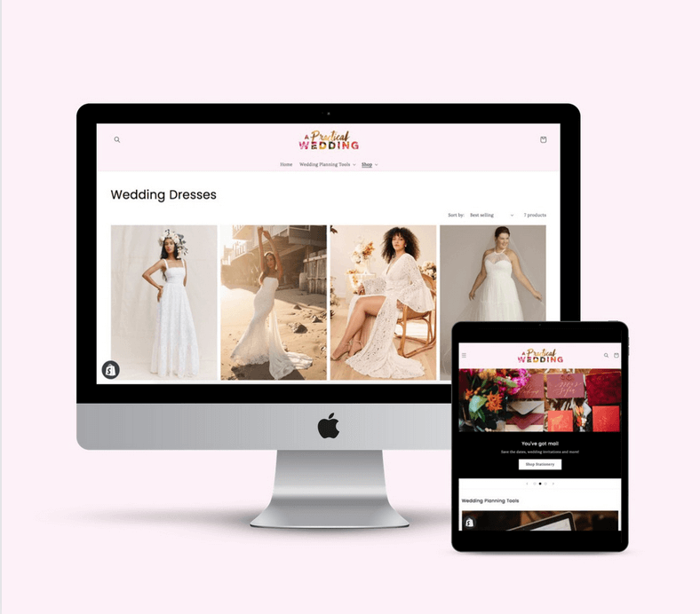
![]() This post was sponsored by Squarespace. We are thrilled to be continuing our partnership with Squarespace talking about what it means to be a woman with #goals in 2018. Whether you’re stepping up in your career or striking out to do your own thing, one of the best things you can do for yourself is create a place online where you can show off your work in the form of a portfolio site, an online resume, or another hub that displays just how awesome you are. Squarespace provides the creative tools that make it easy to build your online home beautifully, even if you’ve never made a website before and have no idea where to start. Click here to get your website started today with a free 14-day trial from Squarespace. APW readers get 10% off your first Squarespace purchase when you use the code APW18 at checkout.
This post was sponsored by Squarespace. We are thrilled to be continuing our partnership with Squarespace talking about what it means to be a woman with #goals in 2018. Whether you’re stepping up in your career or striking out to do your own thing, one of the best things you can do for yourself is create a place online where you can show off your work in the form of a portfolio site, an online resume, or another hub that displays just how awesome you are. Squarespace provides the creative tools that make it easy to build your online home beautifully, even if you’ve never made a website before and have no idea where to start. Click here to get your website started today with a free 14-day trial from Squarespace. APW readers get 10% off your first Squarespace purchase when you use the code APW18 at checkout.