I do a lot of unofficial coaching. I enjoy a sounding board for my friends in small business. In fact, last month I launched my refreshed website into the world, and am creating a program for more official coaching—that’s how much I love it. I’m a pep talker for my friends with mental health issues (in fact, it’s #mentalhealthawareness month, and we’ve never needed it as much as we do right now). I’ve spent so much time in quarantine giving advice that I’ve started to pull together a cheat sheet of things that really help make the world feel a little less bleak. And besides the obvious (eating healthy foods, getting enough sleep, exercising, etc.) the list goes a bit like this:
- Use this time to try a bunch of new things, and give yourself permission to fail at all of them. (Seriously, no pressure, because what the heck else do you have to do?)
- Teach someone something
- Learn something new
It’s become almost a joke that the word for 2020 is Pivot. And you know, sure. None of us came into 2020 with the hope that the universe would burn all our plans to the ground, and we’d have to start fresh. Yet, it’s May, and here we are. And on my best days, ‘pivoting‘ is the place where I find joy. If I can move past the place of terror and anxiety, I can use this great pause as a chance to figure out how to solve problems or try all the things I’ve been meaning to try or learn something new. And I’ve found that whatever happens in my brain when I learn something new, is magic. That’s been the joy I’ve found as I’ve created a completely refreshed MegKeene.com (read more about that here).
Which is how I came to teach myself all kinds of design tricks on Squarespace websites. And because teaching people a skill also does a wonderful thing in my brain, I’m really excited to get to lay some newfound knowledge on you today.
Websites are my Pivoting Tool
But first, let me give a shout out to Squarespace. As a business owner in 2020, I have a ton of ideas. And the thing about ideas is sometimes they work, and sometimes they don’t. But you have to have a way to test them out. The amazing thing about the internet overall is that it lowered the barrier of entry to so many entrepreneurs. (That’s how APW exists. I had no capital when I started it, but in 2008, it was possible to start a big website without any cash.) I love APW, but the site itself is a big expensive build, that takes cash and developers time to change. And in 2020, I can’t be throwing around lots of money. Which means I’ve been so, so grateful to Squarespace because their platform lets me easily build professional websites that do… pretty much anything I need them to do… for a really low monthly fee. (And I don’t even have to start paying during my trial period. I can start building a website for literally $0, and only pay for it if I decide I like what I built. And a friendly reminder, APW2020 gets you 10% off!) Two months into quarantine, I’ve built HotlineRing.com and re-built MegKeene.com from scratch. And yes, I have two more website ideas I need to get cracking on. (Build your first Squarespace website, you’ll see why I’m addicted.)
Not only has Squarespace democratized building websites, but they’ve democratized building really good, really professional websites. The thing I hear most often when I launch a website into the world is, “You did that on Squarespace? But how?” And the answer is: easy, self-taught design tricks, and Squarespace’s super friendly platform. We’ve shared a step-by-step for building a website (ignore that it’s a ‘wedding wesbite’) and a bunch of other great content here—go take a peek. You can totally do this. All of the simple design tricks I’ve learned can be applied to your wedding website, your portfolio website, or the new business idea you just came up with. They’re easy enough that even someone with no design training (me), and no coding or HTML training (also me), can make a Squarespace website that looks completely custom… easily.
When I sat down to write this, I was convinced I was going to teach you every single piece of design info you need to make a super custom looking Squarespace website. But my friends, even with Shelter In Place, that is too much for one day. So let’s start with the thing that will make the biggest difference in your website: Your Squarespace Color Palette.
Let’s learn something new together.

How To Pick A Color Palette
 Every design tip I have starts with, “Back in the day on the internet, we had to walk to school uphill both ways in the snow.” And color palettes are the same, so I’ll spare you the story.
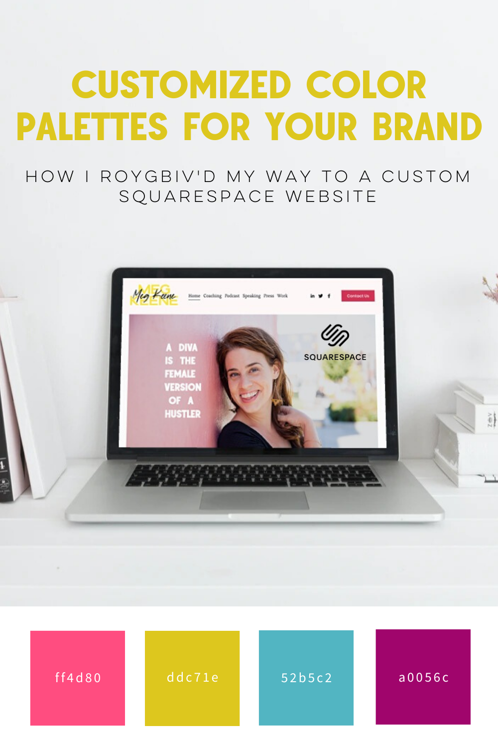
The good news is, these days there are lots of tools you can use to create a cohesive Squarespace color palette. The one I use is Coolors.co. It’s free, super easy, and lets me save palettes once I’ve created them.
Pro-Tip: At least one of those should be an accent color. Think of this as your “pop” color. Often you want this to be something across the color wheel from your primary shades, that allows your eye to see the rest of the colors better. I tend to pick colors in the pink and purple family, so adding something in the yellow family brightens things up, and allows your eye to read the pink and purple for what they are, instead of just as a blur.
It’s also really fun. You basically spin the wheel, and as colors appear that you like, you lock them in, and keep on spinning till you have a combo of colors that you love. Better yet, Coolors.co lets you pick colors off of a photograph.
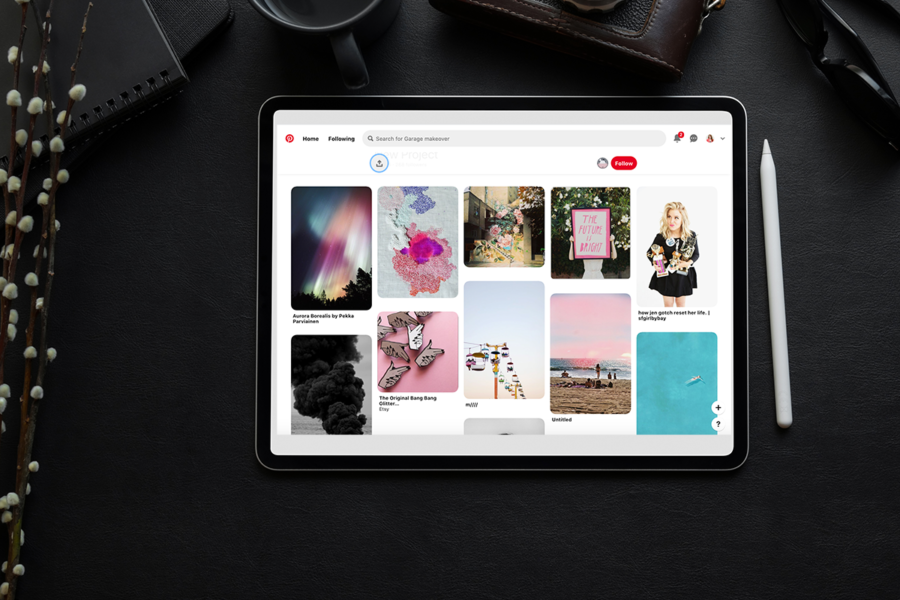
Pro-Tip: I often put together a mood board on Pinterest for my project, then screen shot the mood board, and use that photo to select my Squarespace color palette. My mood board often has the same colors over and over, and it lets me figure out what my overall vision is.
How To Change The Color Palette Of Your Squarespace Website
In this post, almost everything you’ll work on lives in the “Design” section of the backend of your site.
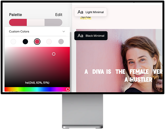
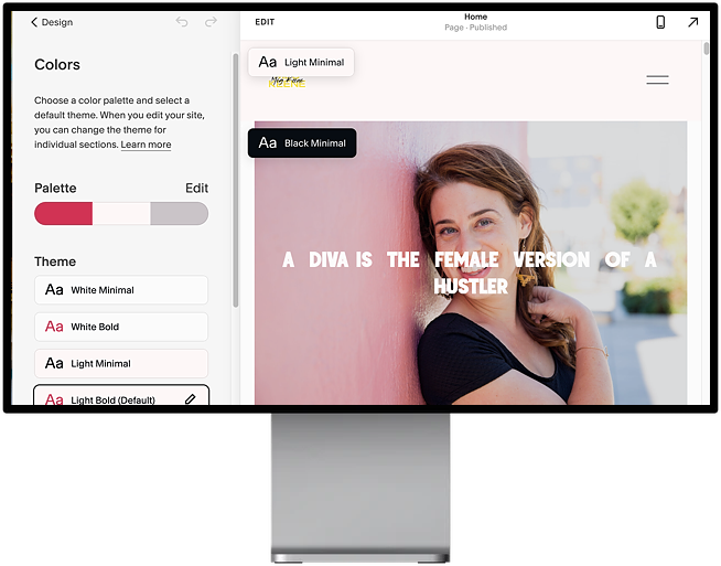
Go into “Design” and select “colors“. You’ll see a palette, and from there you’ll want to hit “Edit.” The Squarespace color palette you edit, in full, will have 5 colors. The first two are white and black, and you’ll likely want to keep those the same. (Sometimes I fine-tune to create a slightly off-white or off-black, but that’s minutia stuff.) The next three colors are the main colors that you have to work with.
Pro-Tip: If you created a color palette with Coolors.co, you will have 5 colors. Here you’ll only have three. Black and white are already taken care of, so if you have something close to a black or a white, remove those from the five. You’ll also want to remove your “pop” color (discussed above). You can bring that back in with a logo or photos (something I did on the MegKeene.com site). But these three colors will be used in big swaths in the design, and that lime green, yellow, or hot pink is something you want to use sparingly.
When you’re selecting colors, you want to match them to the ones that Squarespace has auto-generated. You should put your lightest color where their lightest color is, and your darkest color where their darkest color is. Doing that will make your shades fit into the Squarespace color templates in the way that they were designed to.
Pro-tip: There are different ways to code colors for design, and you may find that you need to convert your colors. You can use Hex, RGB, or HEL color codes. I find it’s easiest to just copy and paste the Hex Codes that Coolors.co gives you right into the Squarespace color picker—Hex codes are those 6 digit number/letter codes that define each specific color. But if you need other codes, Coolers.co also converts it for you. Just click on the Hex code and you’ll see every variation of color code you could ever dream of.
How To Select Your Color Theme on Squarespace
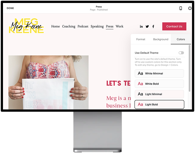
If you’ve just modified your color palette, you are currently in Design –> Colors. Below the Palette, you’ll see a list of “Themes”. These are named things like “White Minimal”, “White bold”, “Light Minimal”, “Light Bold,” etc. Each one uses the colors that you’ve selected slightly differently. Now is the time to play around with them. As you hit each theme, you’ll see it show up on your site, to the right. (And if you don’t like the way they look, it’s a great time to adjust your color palette, or adjust the order of your colors on the palette).
Pro-Tip: I found that Light Bold felt the most fresh and up to date. We’ve moved away from everything on the internet being pure white, but we are (thankfully) not back to the early 2000’s/ Oregon Trail vibe of everything being black. Light Bold gave me a solid wash of a light color with some bright accents, and it all felt very 2020.
How To Adjust Colors Within Your Squarespace Theme
If you don’t modify your website’s colors, the way each color is used in the theme will make perfect sense. (I  mean, of course. Squarespace designers combed through the designs and tweaked everything to make the magic happen.) But after you create a custom Squarespace color palette, that won’t always be true. As you’re working through your site, you may find yourself wishing you could change the color of the text on buttons, or the color that linked text shows up.
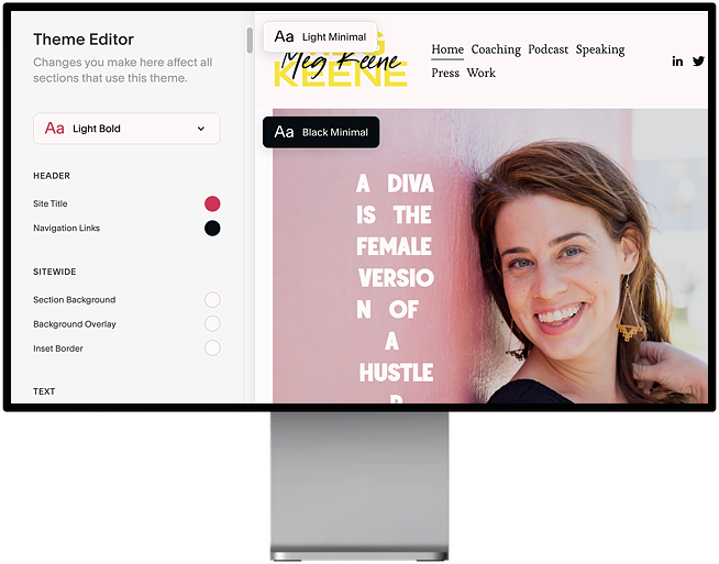
Never fear! You can. Hover over the theme (Light Bold for example) and click the edit button on the right, now you can change the settings and customize the colors of just about anything in the Theme Editor. You’ll see a long (long) list of each element on the site, and what color is assigned to it. With a little digging around (and sometimes trial and error) you can find that exact element, and change the color. This means you can customize your Squarespace color palette down to the most finite details, if you want.
How To Use A Variety Of Themes On Your Squarespace Site
If you’ve read all of the above, you may get the sense that the only flexibility you have is to pick your Squarespace color palette, pick a theme, and that’s it. But nope!
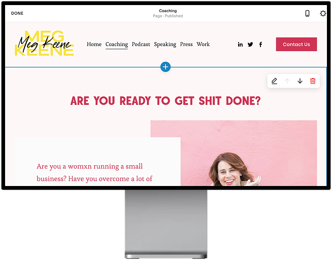
For each block you add to a Squarespace site, you can adjust the colors. If you scroll over the top right of each block, you’ll see an icon that looks like a pen and paper. Hit it, and you’ll be into the editing pop-up. It has three tabs, and the third tab is “colors”. When you get there you’ll see “Use Default Colors”, which will be switched on. If you switch it off, you can pick any one of your themes for that block of text.
Pro-tip: Once you discover all the power you have over the colors on your website, it’s tempting to make every block a different color theme. Trust me. I did it. So, go for it. Get messy. Move things around. And then after you do that, you may learn (I did) that it’s best to use the same color theme on most of your site to give it a sense of cohesion. But feel free to pull the theme change out of your back pocket if you’re not happy with how a section of your site is looking. It make be the magic wand you need.
I’ve got more goodness coming for all of your building websites to match your new plans. Those might be new wedding plans, or new job plans, or new small business plans. Whatever they are, it turns out with some basic back pocket design skills, you can learn how to create a website that looks totally custom.
Yes, you. The person who knows no coding, color theory, or HTML. Because if I can do it, you can too. (Get going on your Squarespace color pallet this month, and next month: fun with fonts. And I really do mean fun.)

This post was sponsored by Squarespace. We are thrilled to be continuing our partnership with Squarespace talking about what it means to be a woman with #goals in this modern world. Whether you’re stepping up in your career or striking out to do your own thing, one of the best things you can do for yourself is creating a place online where you can show off your work in the form of a portfolio site, an online resume, or another hub that displays just how awesome you are. Squarespace provides an all-in-one hub (including easy to use templates that you can customize to your hearts content) that makes it easy to build your online home beautifully. Never made a website before and have no idea where to start? Check out all of our content on Squarespace websites, we’ll help you out. Click here to get your website started today with a free 14-day trial from Squarespace. APW readers get 10% off your first Squarespace purchase when you use the code APW2020 at checkout.

