Even though there is plenty to complain about when you’re planning a wedding in 2017, we have one thing to be grateful for. We’ve reached the point of total acceptance of the wedding website. Wedding websites have so totally hit the mainstream, that instead of complaining that it’s tacky, your grandmother is going to complain if you don’t have one. Which is a great thing. Because a wedding website is your first line of defense against people with too many questions. Plus they are excellent for people like me who can’t ever seem to keep their shit together long enough to remember exactly what time the ceremony starts. Aka, put in a lazy Sunday afternoon of work, and you’ll have one centralized place to point every person in your life with an annoying question, from here till your wedding day.
But since wedding websites are still a relatively new phenomenon, there isn’t a whole lot of standardization about what should go on said wedding website. Just the basics? Or a living testimony to the history you and partner share together?
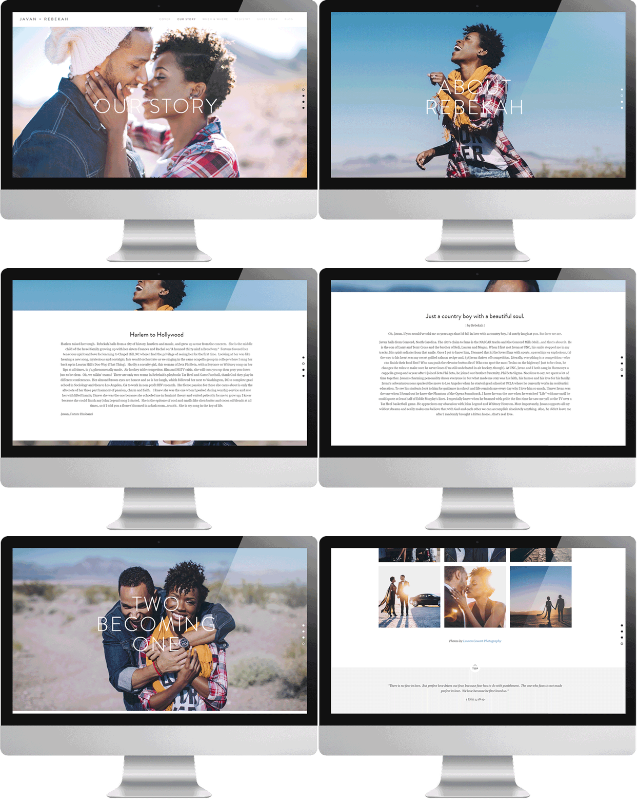
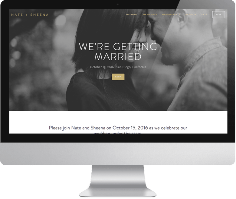
Like wedding invitations, wedding websites are primarily functional. I mean, thanks to the Universe (and Squarespace), we no longer have to suffer through the wedding website that looks like it was made in 1998, and instead we can have something super beautiful for not much work. But still, at the end of the day, your wedding website needs to convey information in a really clear way. And because I keep seeing people make the same mistakes over and over (sorry for throwing you under the bus, friends that are getting married), we’ve partnered up with Squarespace today to share some of our best tips, learned from real life scenarios, for not screwing up your wedding website.

1. Don’t overthink it.
As a procrastinator, I know how it goes. You sign up for a wedding website, start designing it, and then realize you don’t quite know what you want to say. And you can’t find that perfect picture of you and your partner from last summer where you both look super hot and are actually looking at the camera. So you give up and Netflix binge instead.
Stop that, and get to work. First of all, Squarespace has already done the hard part for you by offering hundreds of beautifully designed website templates to choose from that a) look like they actually belong in the 21st century, and b) can be easily customized to fit your wedding vibe (and for the #lazygirls in the room, that also includes wedding-specific website templates that come pre-programmed with all the important pages your wedding website needs.) Which means you don’t have to spend hours trying to make it look beautiful (because it already is.) And bonus: Squarespace has a built-in logo maker that makes it easy to design a coordinating monogram that goes with your wedding website (you can see some we created ourselves right here). Not to mention, most people are coming to your wedding website for a few key details, namely:
- What time the wedding starts
- Where you’re registered
- How to RSVP
- If it’s a cash bar
So repeat this mantra back to yourself: done is better than perfect. And spoiler alert: it probably already looks way better than you think anyway.
2. Don’t MAKE DEMANDS.
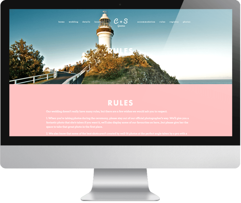
The purpose of a wedding website is to provide information to your guests, not proclamations. (Proclamations are for your wedding ceremony and should generally be ones of love, obvi.) Why? Because your great aunt has been going to weddings since before you were a twinkle in someone’s eye. This is not her first rodeo.
But maybe she’s never been to a wedding with two brides before. Or maybe she doesn’t know what to expect from an interfaith vegan wedding. Or maybe you just want to make sure she doesn’t show up to your camp wedding in four-inch stilettos, or at least that it’s a conscious decision if she does. So what do you do? Give your guests all the relevant information they need to make smart choices about your wedding, and then let them be grown ups. For example, if you really don’t want people buying you a gift, avoid things like, “Do not buy us gifts. We have everything we need.” Instead, try something like:
We are so happy that you’ll be able to join us for our wedding. As many of you know, we’ve been together nearly a decade, and our house is already filled with all the things we could ever need to make it a home. While the presence of your company is the only gift we could ever ask for, an alternative registry has been set up here for those who have expressed an interest in offering a gift to mark the occasion.
That’s it! The bare minimum is all anyone needs to make an educated decision. You know why? Because stubborn people are going to do what they want to do anyway. At least this way, the people on the fence will be more inclined to do what you want them to do, without feeling like you just yelled at them for their good intentions.

3. Don’t do the cafeteria lunch table thing.
There’s nothing worse than going to a wedding website and realizing that you haven’t been invited to half the weekend festivities, handily listed out for you to obsess over and feel bad about.
Are you guys even real friends? Are you not cool enough to go to the wedding picnic? What does it mean?! Do not Regina George your guests. Instead, if there are events where only some of the guests are invited, keep those details separate (digital invites are a great way to coordinate that). No one wants to feel like a second-class wedding guest, you feel me?
4. Don’t forget to tell people you have a wedding website.
If you do the work to make yourself a wedding website, don’t screw yourself over by forgetting to actually tell people that your website exists. (I know this seems obvious, but I swear it happens all the time.) In our modern times, people kinda prefer if you give them the URL on their save the date (even if there isn’t much on it yet), and it is totally acceptable to include your wedding website URL somewhere on your invitation or on an insert that you slip in the envelope. (Hot tip: when you buy a Squarespace wedding website, you’ll get a URL that can actually fit on your invite. Win.)
And if you’re worried about your wedding website getting into the wrong hands (like, say, a prospective employer), Squarespace gives you the option to hide your URL from Google searches or to make it password protected. (But guys, make the password easy enough that your guests have a chance of remembering it in the car on the way to the ceremony.)

5. Don’t screw up the URL.
Approximately four months ago, I got a frantic text from one of my BFFs. She’d accidentally printed the wrong URL on her invitations. Whoopsy! So this tip is pretty straightforward: don’t do that. Make sure you double and then triple check your wedding website URL before you order your invitations. Thankfully my friend was able to contact Squarespace support, who helped her purchase the extra URL she’d accidentally printed, and direct it to the website she’d made, but you’d probably rather not do that.
And if all else fails, just ask yourself these questions: Is the essential information there? Can my guests find it? DID I GIVE THEM THE RIGHT URL? Ta-da! You officially just didn’t screw up your wedding website.
For more wedding website etiquette tips, check out 5 Things No One Wants to See on Your Wedding Website and What to Include in a Wedding Website to Make It Actually Useful.
CLICK HERE TO START A FREE 14-DAY SQUARESPACE TRIAL AND MAKE YOUR WEDDING WEBSITE TODAY. APW READERS GET 10% OFF YOUR FIRST SQUARESPACE PURCHASE WHEN YOU USE THE CODE APW17 AT CHECKOUT.

This post was sponsored by Squarespace. Squarespace makes beautiful wedding websites happen in a matter of minutes, thanks to their user-friendly software and modern, minimal template designs. Click here to start a free 14-day trial and make your wedding website today. APW readers get 10% off your first Squarespace purchase when you use the code APW17 at checkout.

