When I first got engaged, there was no question more frustrating to me than, “What are your wedding colors?” Okay fine, that’s not totally true. It made me bonkers when people asked me my wedding date a minute after I got engaged, because how on earth would I know that? BUT. Easily the second most frustrating question was definitely, “What are your colors?”
Thinking back, it’s hard to figure out why I found this questions so annoying. Probably because it seemed to speak to some super ’80s, super traditional way of planning weddings that I didn’t want anything to do with. (“My colors are blush and bashful.”) Plus, I didn’t know WHAT my colors were, or how to pick a color palette that seemed modern, and my partner liked. (No weddings drowning in pink for him.) And any wedding planning question where your real answer is, “I have no fucking clue,” is not a fun question to be asked on the regular.
But the intervening decade, here is what I’ve learned:
1. People are genuinely interested in and excited about your wedding (and weddings in general) and they don’t quite know how to express that. “What are your colors?” is often a way to segue way into, “OMG WHAT KIND OF WEDDING ARE YOU HAVING PLEASE DISH.” Because when you’re not planning and footing the bill for a wedding, they’re really fun, and people are looking for a way to talk to your about yours.
2. Wedding colors are really damn helpful. Take it from me. I was so annoyed by the idea of wedding colors, that we decided to not have them. Our wedding would just be “jewel tones” and I told everyone in our wedding party to wear whatever jewel toned colors they wanted. You know what happened? They all showed up in purple and teal, and with horror we realized that we looked like we’d picked a early ’90s (and not in a good way) two color palette.
So the question becomes: How do you pick a color palette that look modern and save you from looking like you’ve outfitted your wedding party as a ’90s sports team? Well, lucky for you, we’ve polled some of the best wedding designers in the business, and we’ve gotten you some answers.
how to pick your wedding colors
First up, you and your partner need to make some very basic decisions: What general colors are you going for? What is the general visual style and vibe that you want? I talked to one of APW’s favorite wedding designers, Michelle Edgemont, and she suggested that instead of picking the traditional two colors, that you pick four (or more) colors, to create more of a palette. This can make decorating feel less restrictive and more organic. If you’re organized, one or two of these colors can serve as your main color, and one or two can serve as your accent colors. If you’re less, uh, focused, having a color palette can simply be a far more relaxing way to decorate.
To bring you some kick-ass ideas for modern color palettes, and not just two of them (“pink and pink“), we asked another APW favorite, Tabitha Abercrombie of Winston & Main, to create some wedding color palettes, and give you inspiration for how to use them. These ten combinations of wedding colors will inspire you. We can’t wait to see how you guys use them.
We’ll break down the color combos in more detail below, but here are 10 super fresh and hip wedding color combos to make magic with.
10 Modern wedding color Combinations
- Lavender + Emerald + Lapis Blue
- Yellow + Coral + Purple + Cranberry
- Ivory + Silver + Green
- Blush + Gold + Blue + Navy
- Apricot + Sage + Greige + Navy
- Mint + Pink + Coral + Magenta
- Island Paradise + Niagara + Lapis + Red Plum
- Hazelnut + Island Paradise + Lapis + Copper
- Greenery + Burgundy + Flame + Dogwood
- Rose Quartz + Cotton Candy + Pink Yarrow + Island Paradise
Now let’s dig in.
Wedding Colors In Action
Photos by: With Sol Studio | Ali and Garrett | Energy Muse | Paula Bartosiewicz
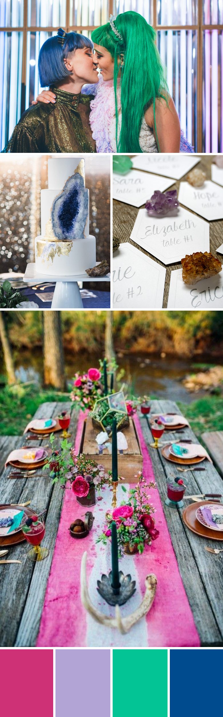
1. lavender + emerald + lapis blue = vibrant boho
These vibrant cool colors paired with pops of pink and lavender are the perfect bold and bright bohemian palette for ’90s color lovers. I love the idea of using organic elements like geodes, crystals, and flowers to bring in the bright color for a personal, layered, and eclectic look. The unexpected combination of bright colors and organic elements would pop against a natural setting, perfectly complement a carousel or carnival theme, or breathe a little whimsy into an industrial venue.
Photos by Levi Tijerina | Michelle Edgemont | Sara & Rocky | Cami Jane Photography
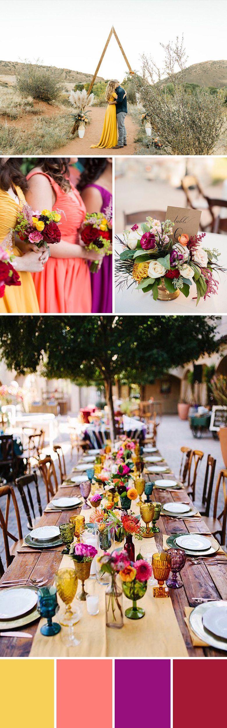
2. yellow + coral + purple + cranberry = sunset
Bold jewel tones make for a fun and fiery sunset palette. These saturated colors have more depth than their primary counterparts, creating a happy, warm, and inviting atmosphere. For a traditional or modern look, use jewel tones sparingly and with clean lines, or generously layer them together with more organic shapes for a brilliant bohemian palette. Desert or city, these dynamic colors set the tone for a cheerful party.
Photos by Jonas Seaman Photography | A Guy and a Girl Photography | Michelle and Logan | Erin Grace Photography |Alissa Saylor
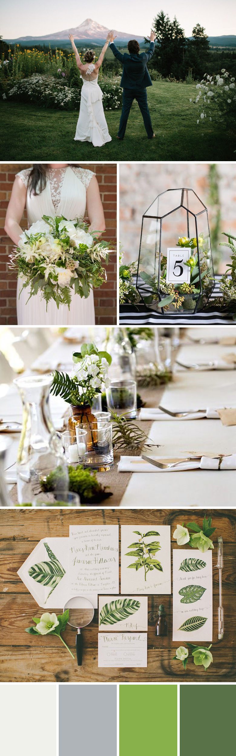
3. ivory + silver + greenery = fresh nature-inspired
This lush palette is bright, fresh, and nature-inspired. Shades of green, simple ivory blooms, and silver accents add dimension and make this palette endlessly adaptable to your style and budget. So whether you favor tropical greens or the forest floor, you can layer on the organic shapes (and shades) for dimensional decor that brings the outdoors in.
Photos by: Kismet | Kerry Jeanne Photography | Love of Creating | The Amburgeys
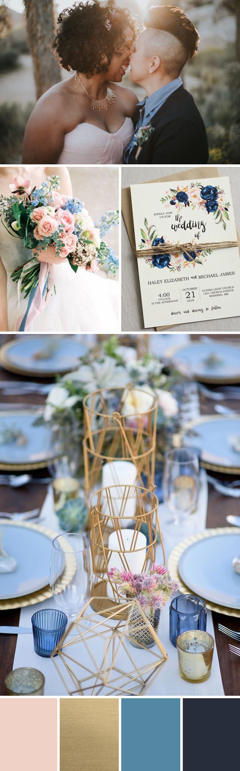
4. dogwood + gold + blue + navy = soft, vintage
Dreamy and calm, this palette evokes the soft light of magic hour. The navy balances and grounds the lighter shades of pink and blue, and the brushed gold adds a sophisticated touch, making this palette romantic and sophisticated, not saccharine. This fresh and ethereal palette would be perfect for a vintage style wedding.
Photos by: Clean Plate Pictures | Loft Photography | Paige Jones Photography | Clean Plate Pictures
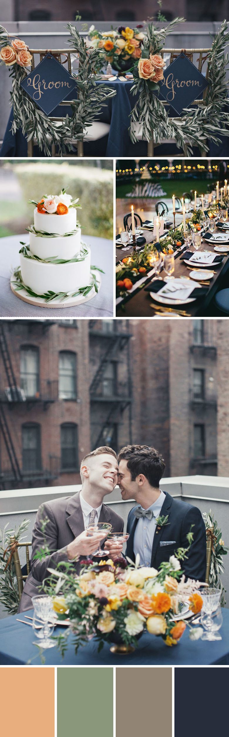
5. apricot + sage + greige + navy = sophisticated
This mellow fall palette in shades of apricot, sage, greige, and navy feels seasonal and sophisticated. Texture, color, and candlelight create a casual elegance that works for rustic and rooftop weddings alike. More subdued than typical fall palettes, the organic pops of apricot and sage in the form of flowers, fruits, and greens keep it feeling fresh.
Photos by: Betty Clicker Photography | AJ Dunlap Photography | The Happy Bloom | Birds of a Feather | We Love Pictures
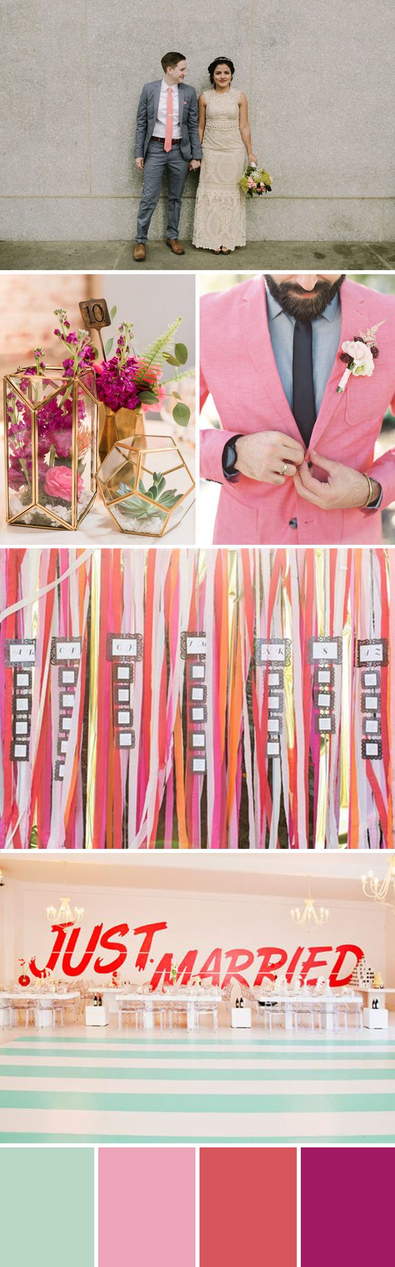
6. mint + pink + coral + magenta = whimsical
Shades of sorbet and mint combine for a fresh take on modern whimsy. This palette feels like a happy dance party with its analogous berry hues and complementary tint of mint! These colors bring bold graphics, playful elements, and unique florals to life, and can be used in any concentration you’re comfortable with—from a dash to a downpour.
Photos by: Peppermint Photography | Beau Coup | Cambria Grace | Paper Antler
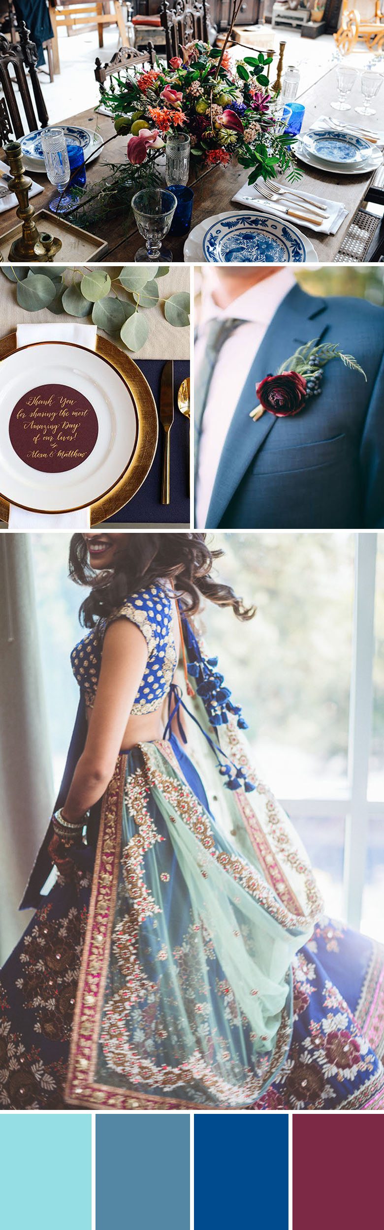
7. island paradise + niagara + lapis + red plum = ELEGANT MONOCHROMATIC
This mainly monochromatic palette uses a variety of blues along with burgundy accents to create a moody elegant feel. Stick to a limited color palette to achieve a sophisticated and cohesive design, while using a few tints, tones, or shades of the same color to create depth and interest. The single and repetitive use of the burgundy accent color further emphasizes this feeling of chic cohesion.
Photos by: | Factory Made | Adept Studios | Christine Arnold
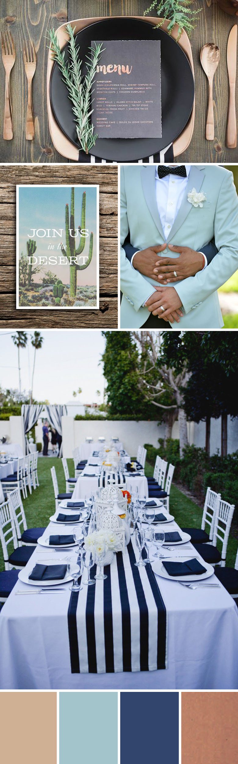
8. HAZELNUT + island paradise + lapis + COPPER = MODERN
Hip, modern, and minimal, this palette of Palm Springs pastels is ready to party. It combines neutral desert hues, hazelnut and copper, with a few shades of blue to bring the minimal decor to life. Neutrals and metallic can be used liberally throughout, with bold strokes of lapis (or bright navy) for a graphic punch.
Photos by: Forever Photography | Jenni Grace Photography | Hartford Prints | Matthew William
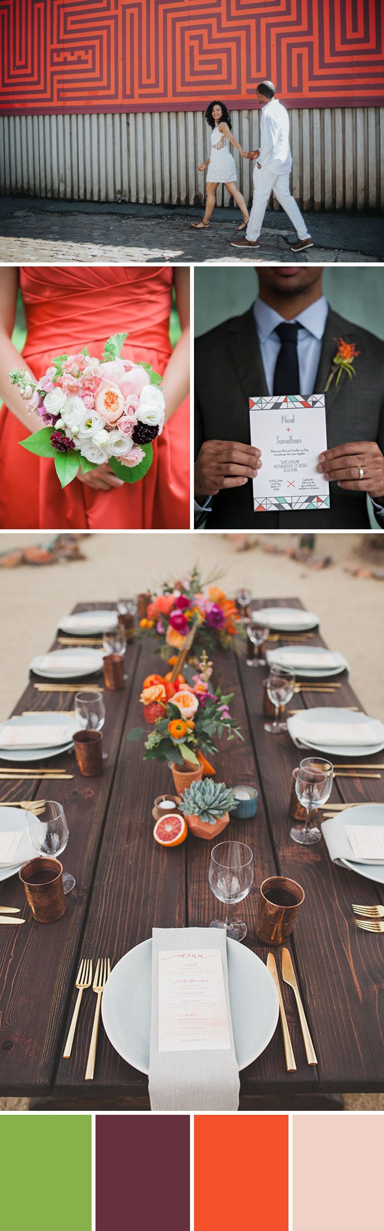
9. GREENery + BURGUNDY + flame + DOGWOOD = CHEERY
I love how the bright pops of greenery and flame are balanced by the more subdued burgundy and pale dogwood, making this palette sophisticated and fun. It’s very flexible and would work for a variety of seasons and venues. Bright and cheery enough for a casual outdoor affair, it could also be used with a more minimal style for a modern loft, gallery, or museum wedding.
Photos by: Katie Osgood | Katie Pritchard Photography | Jana Morgan | Birds of a Feather Photography
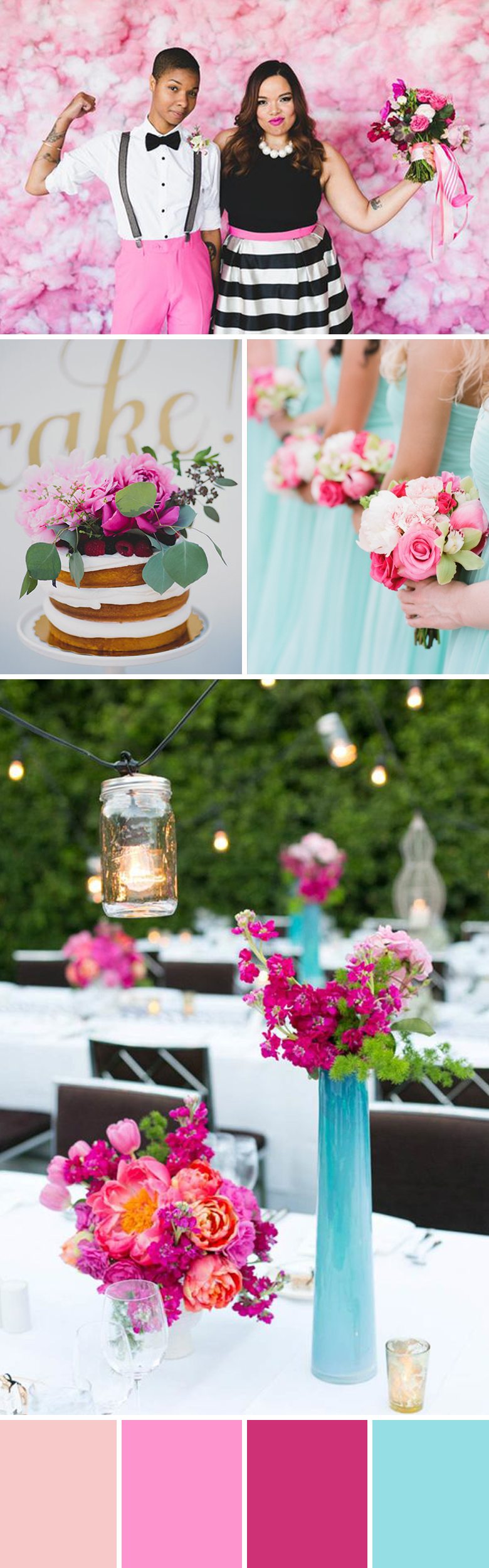
10. rose quartz + cotton candy + pink yarrow + island paradise = WEDDING COLORS THAT POP
This pop star worthy palette is unapologetically bold and bright. The different shades of pink lend dimension to an otherwise simple color combo, and really make the dashes of island paradise pop. With so much vibrant color, details can be kept minimal—think simple vases, smaller bouquets, a few bright cake flowers. Light and bright, this palette pairs perfectly with graphic black and white elements, like stripes, in wardrobe, table top, signs, or invitations.
Did you have colors? How did you pick them? What would you do differently? What did you love? Why will people never stop with the “What are your colors” question?