When my wife and I first started planning our wedding as a queer couple, I found myself uttering the same desires as engaged friends of past, “It’s not, like, a wedding, it’s like, a big party.”
I had never envisioned getting married, let alone planning a capital “W” wedding. I believe in supportive lifelong partnerships and civil rights for queers to be married, sure, but I wasn’t keen on managing the expectations and assumptions of two hundred party guests.
I’ve been to countless weddings that deviated from the church and banquet hall script: two-day summer camp-esque lakeside celebrations, Quaker-driven ceremonies where we yelled “LOVE!” to the Redwoods, DIY BBQs in the backyard of a funeral home (yes), and a motel rager where the bride was wrapped in a Norwegian flag while eating tacos. And I had a great time. I danced, I cried, I felt a renewed sense of community!
But could I navigate the planning my own wedding? Those weddings I listed were not queer couples, and I couldn’t stop thinking about the added challenges we’d face planning our queer wedding. When you’re getting married in any sort of non-traditional way, there’s always the worry of “will our guests understand this thing we’re trying to do here?” But for a queer wedding, there’s an added layer to that. For some of your guests, this may be their first time attending a same-sex wedding. For others, maybe they’ve attended one or two, and have expectations based around those weddings that don’t apply to yours (maybe they think you’ll both be wearing dresses and, surprise, neither of you will!). One of the easiest ways we found to manage those expectations was with our wedding website.
My wife and I used Squarespace for our website, employing the website builder as a platform for helping our guests navigate all the logistics of our wedding, from how to get to our remote island venue to recommendations on where to stay to subtle tips on what to wear. And today APW is partnering up with Squarespace during Pride month to share some creative tips on how to build a wedding website to let your guests know what to expect at your queer wedding from yours truly.
CALL IT LIKE YOU SEE IT
My wife and I knew we wanted three things out of our wedding: a dance party, to celebrate ourselves and our communities, and to feel like we were in a botanical island ocean of love. But we also remembered that some of our guests (especially our elders) had never been to a queer wedding; they might need some guidance on just how to get on board (literally and spiritually) with our island wedding.
So first things first, instead of calling our nuptials a wedding, we called it the Eleganza Extravaganza, both to pay some subtle homages to our Patron Saint RuPaul and to remind everyone that we were here for love plus a dance party plus fabulosity. Our invitations and website clearly stated that people were invited to our Eleganza Extravaganza, and a lot of our relatives excitedly took to the term. On our wedding day, our dear friend and MC of the evening strutted her bedazzled booty up to the stage, and commanded the crowd yell “EXTRAVAGANZAAAAA” in unison to kick off the night.
No matter what the tone of your own wedding is—maybe you want to make it clear that you are having a capital-W wedding, with all the trappings and you want everyone to take it seriously—use your words to convey what it is and what your guests can expect. You might be surprised just how much those verbal cues can cut back on a lot of the explaining for you.
TALK THE TALK
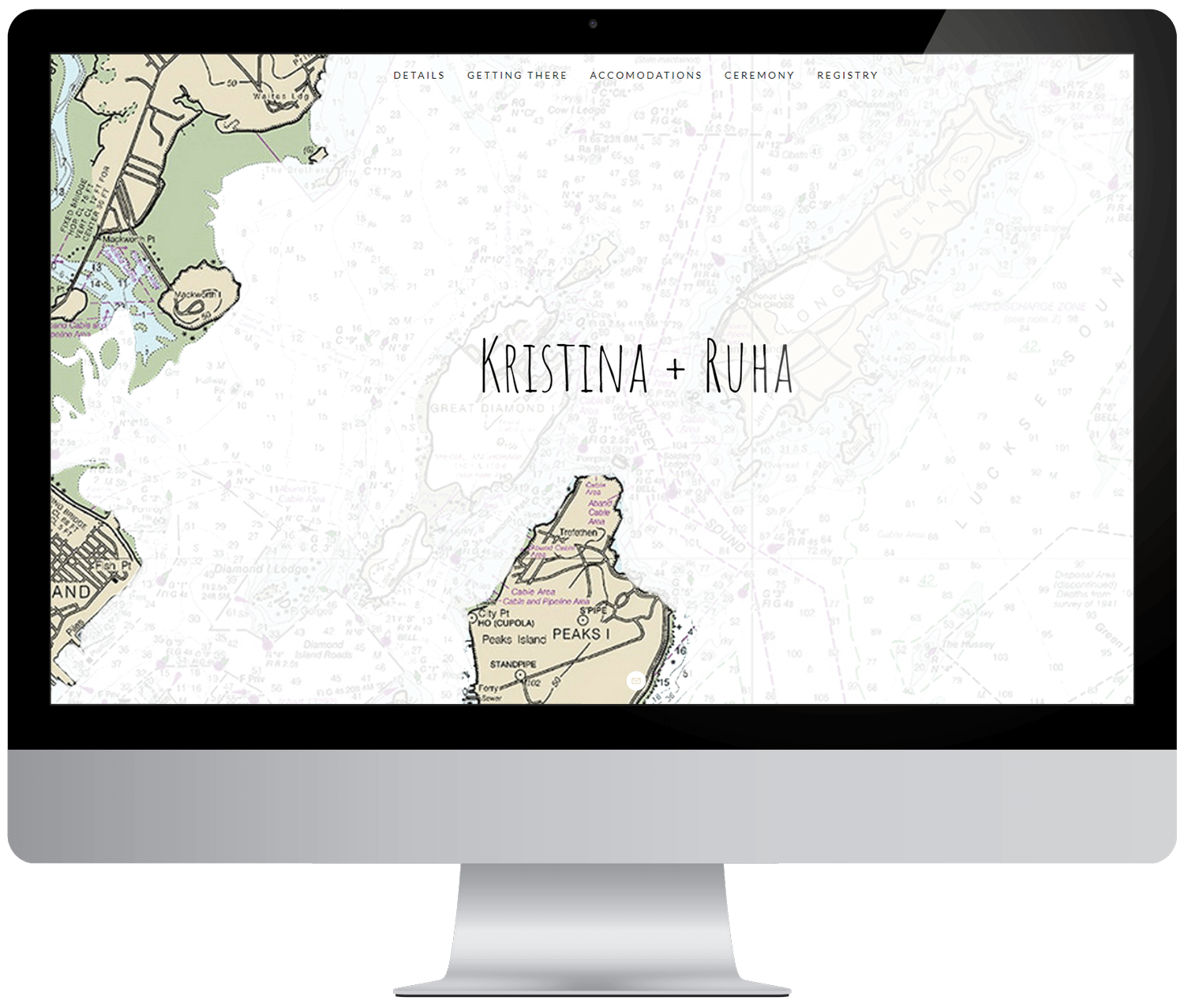
We had guests coming from at least ten different countries and all over the U.S. to a tiny island off the coast of Maine (where four generations of my family were raised). Our website was pretty crucial in helping guests navigate their way to the island and also introducing guests to the vibe and culture of the place. Our web design featured clear recommendations for accommodations and transportation (my wife designed a map for the landing page). But we also made sure the language we used in any communication reflected how our wedding might be a deviation from the hetero-norm. We did that in a few ways:
First, on our “what to wear” page, we quoted my mother who always says, “You look good yah feel good!” We told guests to step it up and wear what makes them feel most fabulous. This instruction was a winking challenge for people to have fun with their ensembles, and the language of this request bypassed the usual gendered recommendations that a lot of websites tend to lean on (i.e., guys: wear a tux!).
Second, we clearly stated that we’d be married by the ocean, something my wife and I feel very connected to—we’re island people (she is Sri Lankan and I am Peaks Islandian). We wanted to clearly signal that we were NOT getting married in a Catholic church, which was certainly a deviation for my traditional Irish-Italian family. If you are getting married in a church or a space that hasn’t traditionally accepted same-sex couples, this is a good way of letting people know to expect this from you. And if they are struggling to see two gays saying vows in front of Jesus, they’ll have some time to grapple with that on their own before showing up to your ceremony. I’ve had friends whose family members skipped the church ceremony but gladly celebrated the couple at the afterparty. In some cases the initially squeamish family member gets so on board with the gay magic, they end up making surprise toasts at the wedding.
Either way, clearly state your wedding day itinerary and details so people know what to expect. Go with your gut, and if someone can’t get on the love train, just choo choo choose to focus on you and let them get on board when they are ready.
LET YOUR PARTNERSHIP SHINE
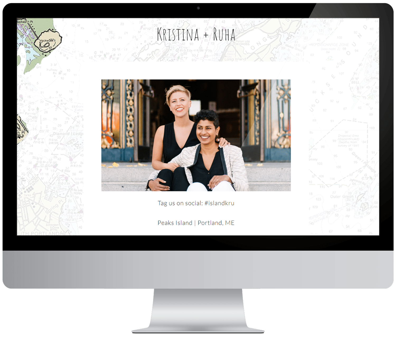
Neither of us were crazy about arranging for engagement photos or having a page on our website that told the story of our relationship. We didn’t have time to do all that—we were trying to turn a boat house into a botanical jungle for God’s sake! So instead of engagement photos we used photos from our city hall wedding. The deal is we actually got hitched legally a year before our Extravaganza because my wife wasn’t a U.S citizen yet, gay rights are fragile in a conservative government, and He-Who-Shall-Not-Be-Named was about to be elected. So, we marched to city hall to ensure we could be partners for life. We had none other than Maddie come out of wedding photography retirement and document the thing (and drink Prosecco with us). Most of our family and guests didn’t know we did this, but we put it in the wedding website as a subtle reveal. Even if they didn’t catch on, they saw my wife and I glowing in all our interracial couple, queer glory. That let them know they’d be seeing a lot of that in their future.
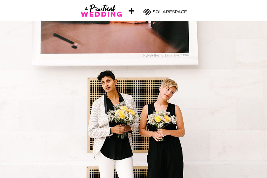
Even if you don’t have fancy engagement photos or secret city hall photos to share, sometimes it’s as simple as sprinkling in a few selfies of the latest version of you and your partner. If you want to set the tone that you and your partner won’t be wearing ball gowns or even dresses to the great-aunts who haven’t seen you since you were five, the easiest way to do that is to let your guests see you in all of your queer glory, rocking a bow tie and undercut. Or gold heels and a bouquet of roses. Whatever your truth is, you can use your wedding website to prepare all the folks who aren’t on Instagram for it.
YOU CAN GO YOUR OWN WAY
Throughout the planning process, we did a delicate dance to abandon some traditional American wedding traditions, while also reminding people that this was in fact a celebration of our union.
For example: Our brothers were our “bridal party” and led us down the aisle with our parents to the tune of Beyoncé’s “End of Time.” We knew we needed place cards for people to find their table, but instead of just paper, we handed out blue calcite crystals that we blessed and saged. Our non-traditional ceremony—a mix of pagan inspired language and tales of my partner and I meeting on the late night at a queer dance party—was led by our genderqueer nature fairy friend Tash. Any worry I had about my Catholic great-aunt’s reactions to our ceremony quickly dissipated when people came up to Tash confessing that they would join Tash’s cult if Tash started one.
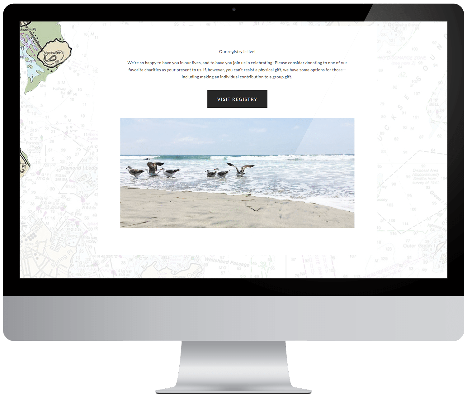
Like I said, we ended up getting married in the year He-Who-Shall-Not-Be-Named became president. Right before our wedding, the Muslim Ban flared up once again. We were feeling angry but motivated to use an aspect of our wedding to have some sort of positive social impact. So, in addition to our registry, we offered our guests the option to donate to three charities that represented the causes we were most passionate about and had a deep connection with (we made a simple button linking out to an external registry, but you can also add any charity registry directly to Squarespace using their image blocks). A lot of people enthusiastically donated money to these causes, as it gave them an opportunity to do something small but meaningful in our name.
POWERFUL WITH A LITTLE BIT OF TENDER
While I wish there was a magical formula to making sure everyone at your queer wedding is 100 percent down with your choices, the real secret is that if you are able to beam out all that makes you shine, and allow your family to fully witness you and your partner’s reality, your love will be contagious and people will (mostly) get on board.
For us that meant glitter, a nature fairy officiant, and our first dance to be led by my mom, like a pied piper of femmes, to Beyoncé’s “Grown Woman.” Whatever you want your queer wedding to achieve, whether it is acceptance and equity or radical deviation, just do you and clearly communicate it. I’m willing to bet that if you do that, your guests will never want to leave Wedding Island.

This post was sponsored by Squarespace. Squarespace makes it easy to build a website in a matter of minutes, thanks to their user-friendly software and modern, designer website templates. Every yearly Squarespace purchase also comes with a custom domain, and of course, their award-winning customer service (just in case you get stuck). Click here to start a free 14-day trial and make your wedding website today. APW readers get 10% off your first Squarespace purchase when you use the code APW18 at checkout.

