Up till now, our Squarespace wedding website tutorials have been comprised of tips for people who care about good design and who have the patience to play around with a template and make it their own. (Because sometimes you need a wedding project that doesn’t involve hot glue, y’know?) But today we thought we’d switch things up a bit and offer a tutorial for the #lazygirls in the house who still want the good design part, but who’d prefer not to have to…try. The truth is, you don’t really need a ton of professional photos or complex graphics to make a wedding website that’s better than ninety percent of what’s being offered by the wedding industry. Plus, it’s all about the info anyway, right? So we’ve got a few helpful tips for easy logos that can standalone on your wedding website, still look damn good, and leave you enough time to catch up on your DVR. Um, I mean, your seating chart.
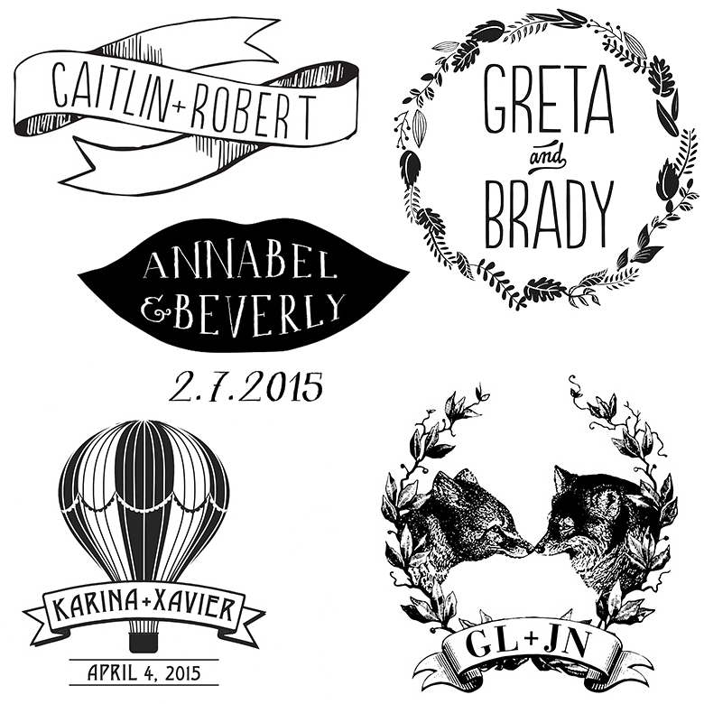
The Ultimate Hack: If you want a logo that looks custom, but without the custom price tag, the hands-down easiest logo hack available is just… buying one. While custom logos created by full-time designers are rightfully worth the money they cost, you can usually buy a pre-designed semi-customizable wedding logo for cheap—think $25–$50. Simply choose a design you like, pick your color(s), supply your names, and ta-da! Custom(ish) wedding logo for you. These pre-fabbed logos are typically made by professional designers, so the skill is there, you’re just not getting one hundred percent custom work (which, for a website that’s only going to be looked at for a year or so, is probably fine). You can get a wedding logo by APW’s own A Printable Press, or all over Etsy (just do a search for “wedding logo”). Bonus: you can use your website logo for other wedding-related goods like save-the-dates, invitations, favors (if you’re having them), or temporary tattoos (because, obviously).
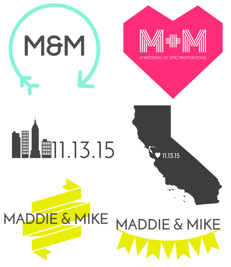 The DIY-ISH hack: If you’re designing a wedding website with Squarespace and you want to customize a simple logo, your easiest option is to use Squarespace’s built-in logo maker. You get three components to play around with in the Squarespace logo maker: a title (like, your names or initials), a tagline (maybe your wedding date?), and a symbol (because your wedding deserves to have anything Prince has). You can change the color, size, and position of any of the three. If you’re not sure what kind of symbol you want to use, I found it helpful to browse The Noun Project (where Squarespace sources the symbols) for ideas. Not every symbol on The Noun Project is available through Squarespace’s logo maker, but you can generally find something similar if you search by the right keyword. For example, I wanted to find a graphic with bunting, but got snake eyes when I searched using the word itself. A revised search for “flags” yielded a handful of results that looked just like bunting. So when in doubt, go broad. Hacker tip: you can only choose one symbol for your logo, but some basic symbols/emojis (like hearts, stars, etc.) can be created using keyboard shortcuts or copied and pasted into one of your text fields. In the sample California logo above, I found an outline of California using the Squarespace logo tool, and then copied and pasted a heart emoji from this page into one of the provided text boxes). All of the logos above were created using the Squarespace logo creator, and each one took less than five minutes to make. Low-res versions of Squarespace logos are available for free, with high-res options available for $10 (unless you have a Squarespace account, in which case, they are free!).
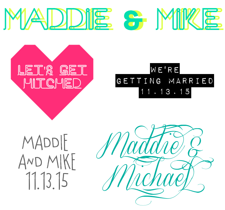
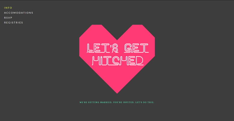
Fonts Used (Clockwise From Top): Neon, Impact Label, Sverige Script, Virginia Is For Lovers, Neon (combined with a free graphic from Squarespace via the Noun Project)
The Make It Pretty With Fonts Hack: All Squarespace websites come pre-designed with a text logo that you can change using the fonts supplied by Squarespace. But maybe you want something a little fancier than the Squarespace fonts, without all the trouble of having to create an actual logo with graphics and stuff. In that case, say it with fonts (because cool fonts make everything better). You can download free fronts at places like fontsquirrel.com, dafont.com, and myfonts.com MyFonts has both free and paid fonts, but if you search by price you can weed out the paid or prohibitively expensive fonts. If you just want to do a simple logo with fonts and no graphics, you don’t even need Photoshop. (I think I made my first logo in Picasa? Don’t judge me.)
Once you’ve finished your logo, login to your Squarespace dashboard, click on the gear-shaped icon on the left hand side of the screen, and then choose the option that says “upload your logo.” Upload your design and you’re done! If you aren’t adding any pictures to your wedding website, you can still customize your design by changing the background colors to complement your logo. And it really is that easy. In short, a good logo hack is the design equivalent of break-and-bake cookies. As long as you have something nice to share with everyone, nobody’s going to care how you made it. And you can take that one to the bank.
SQUARESPACE IS OFFERING 10% OFF YEARLY SUBSCRIPTIONS TO ALL APW READERS. JUST USE THE CODE APW14 AT CHECKOUT! CLICK HERE TO START YOUR 14-DAY FREE TRIAL.

This post was sponsored by Squarespace. Thanks Squarespace for helping make the APW mission possible!


