One of the hardest parts of planning a wedding is that there are no cookie-cutter solutions. Every couple getting married is figuring out their specific combination of wedding headaches for the first time, every time. Oh, your outdoor ceremony has no way to amplify sound, but your uncle really wants to sing an original song while you walk down the aisle? Cool, you’ll just become an audio engineer in your spare time and figure that one out. Your family that lives on another coast can’t attend the wedding but would love it if you could live stream it? No problem, you’ve got a camera lying around somewhere, right? It’s like every day is a surprise party you didn’t ask for.
There’s no easy way to stem the tide of tiny, yet simultaneously huge, annoyances that pop up during wedding planning (we wouldn’t be in business if there was). But there are some ways you can ease the pain, even just a little. And these days (thank goodness) one of those ways is with your wedding website. Technology has finally (finally) caught up with tons of wedding problems that we’ve helped people solve piecemeal over the last twelve years.

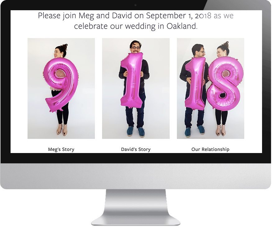
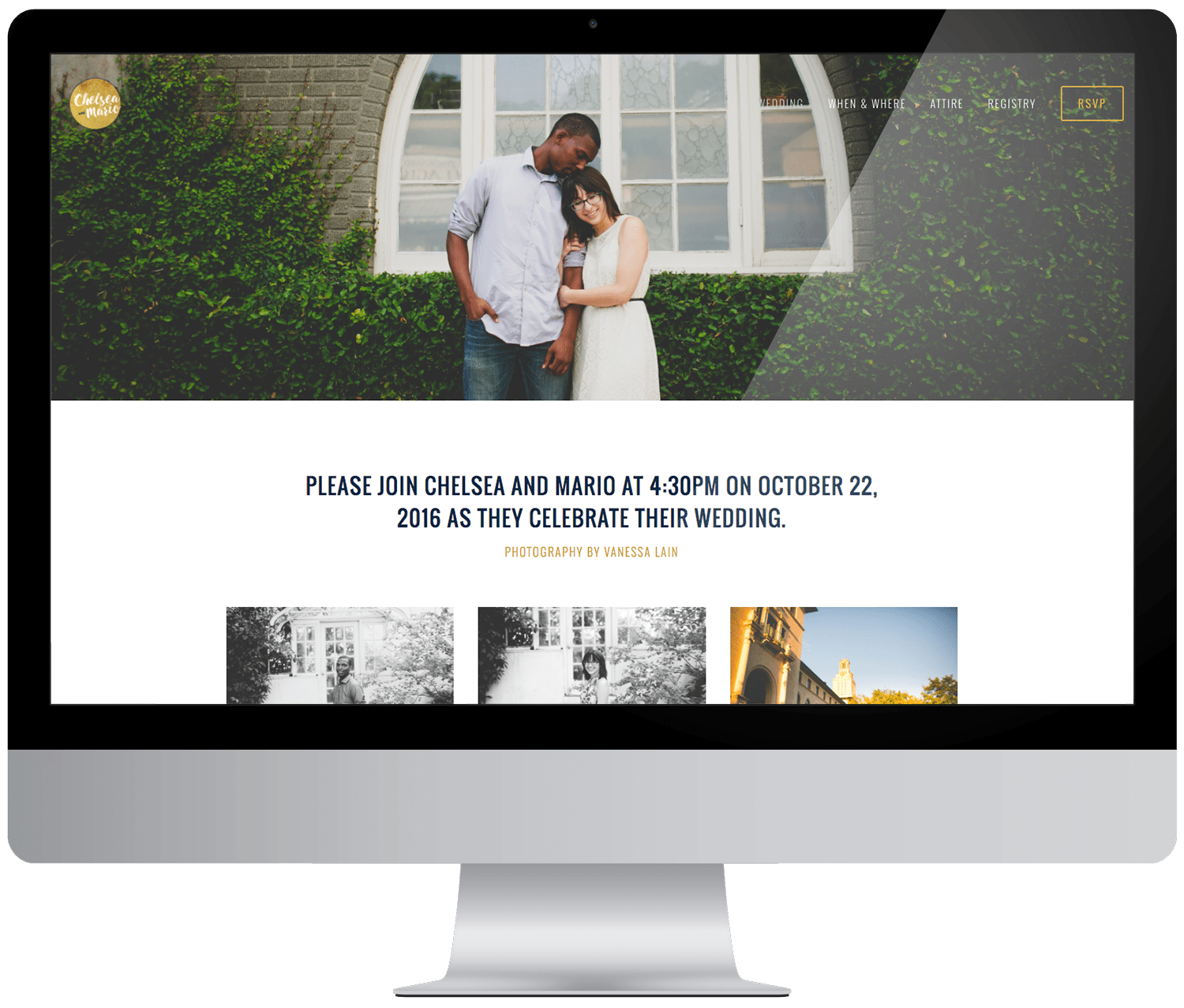
We all know that your wedding website is like a secret weapon against annoying questions from your family and unnecessary texts from your slacker friends. What time does the ceremony start? Check the website. Can I bring my kids? Check the website. Are you serving gluten-free meals? Check the website. We also learned in the last few years that it is a super helpful tool to disseminate vital information about changes to your plans (ugh). (And the best part is that Squarespace’s designer templates let you create a website that conveys all that information beautifully.)
Thanks to Squarespace’s tireless work and innovations, there are now some even bigger problems you can solve with plug-and-play technology. This means that on top of providing the who/what/where answers your guests are looking for, you can also modify your wedding website to solve your own problems (and when I say modify, I mean with one-click solutions, not complicated coding). So, when the questions go from “What time does the ceremony start?” to “Wait, what was Aunt Sally’s plus-one’s name, and is she vegan?” you’ll have a tool that can help.
So today I’m sharing four of my favorite Squarespace wedding website hacks that will solve the tiny annoying problems you didn’t even know you had yet, but probably will.

Ramp Up Your RSVP
If you’ve never played around with Squarespace before, the first thing you should know is that you can try out as many of their templates as you want with your 14-day free trial. And that all of their website templates use super user-friendly drag-and-drop software. But the nice thing about their wedding-specific website templates is that each one comes with a built-in RSVP button—and even if you pick a template that doesn’t, you can add it super easily. While once upon a time (actually not that long ago), most of us still handled RSVPs on paper and then tried to track all the information with unwieldy spreadsheets (I mean, I did), those days can THANKFULLY be gone, with a good wedding website.
I could write paragraphs about how managing RSVPs and trying to chase down all the information you need can unexpectedly be one of the single most stressful parts of wedding planning. But I won’t, because now I can suggest you use Squarespace’s RSVP feature and go spend your time on something (literally anything) else.
With Squarespace, your RSVP button can do more than just tell you if your guests are coming to the wedding. Since you can customize Squarespace’s online forms to ask anything you want, you can format your RSVP to ask questions like the name of your guests’ plus-one and their menu preference. Or if you’re having the kind of wedding that requires extra logistics (I’m looking at you summer camp weddings), you can gather lodging information, childcare needs, and other travel details. That information will automatically port into Google Drive (where I’m guessing the rest of your wedding organization already lives—if it doesn’t, it should). And here’s a cool tip: if you want to increase your chances of your guests actually seeing your RSVP form, put it on several pages. You can add an RSVP button anywhere on your wedding website, so if you’re worried that your family might get lost once they leave the homepage, do them a solid and include your RSVP button wherever you think they might go browsing… or literally everywhere.

Integrate Your Registry
Because APW is made up of a team of Hermiones, when Meg originally set up her own wedding website, she connected it to Google analytics so she could track where her guests visited most frequently. (You… can do this with Squarespace, though you certainly don’t have to.) Can you guess which page people visited the most? If you guessed the registry, you’d be right. While Squarespace’s wedding website templates come pre-designed with registry buttons featuring some of the more popular registry providers, I appreciate that they keep these pages open and flexible. You can link out to any registry you want using their image blocks, so if you’re using an indie service, you don’t have to worry about no one ever finding your registry. You can also add a simple donation button if you’re hoping for cash. But the smoothest and simplest feature is theirpartnership with Zola, which lets you insert your registry directly into your website with the click of a button. That means not having to leave your wedding website to find your registry. Huzzah. And bonus: since it links directly with your Zola account, you can then use their tools to keep track of your gifts and thank you card information. So extra points for organization and efficiency.

Go the extra mile (literally)
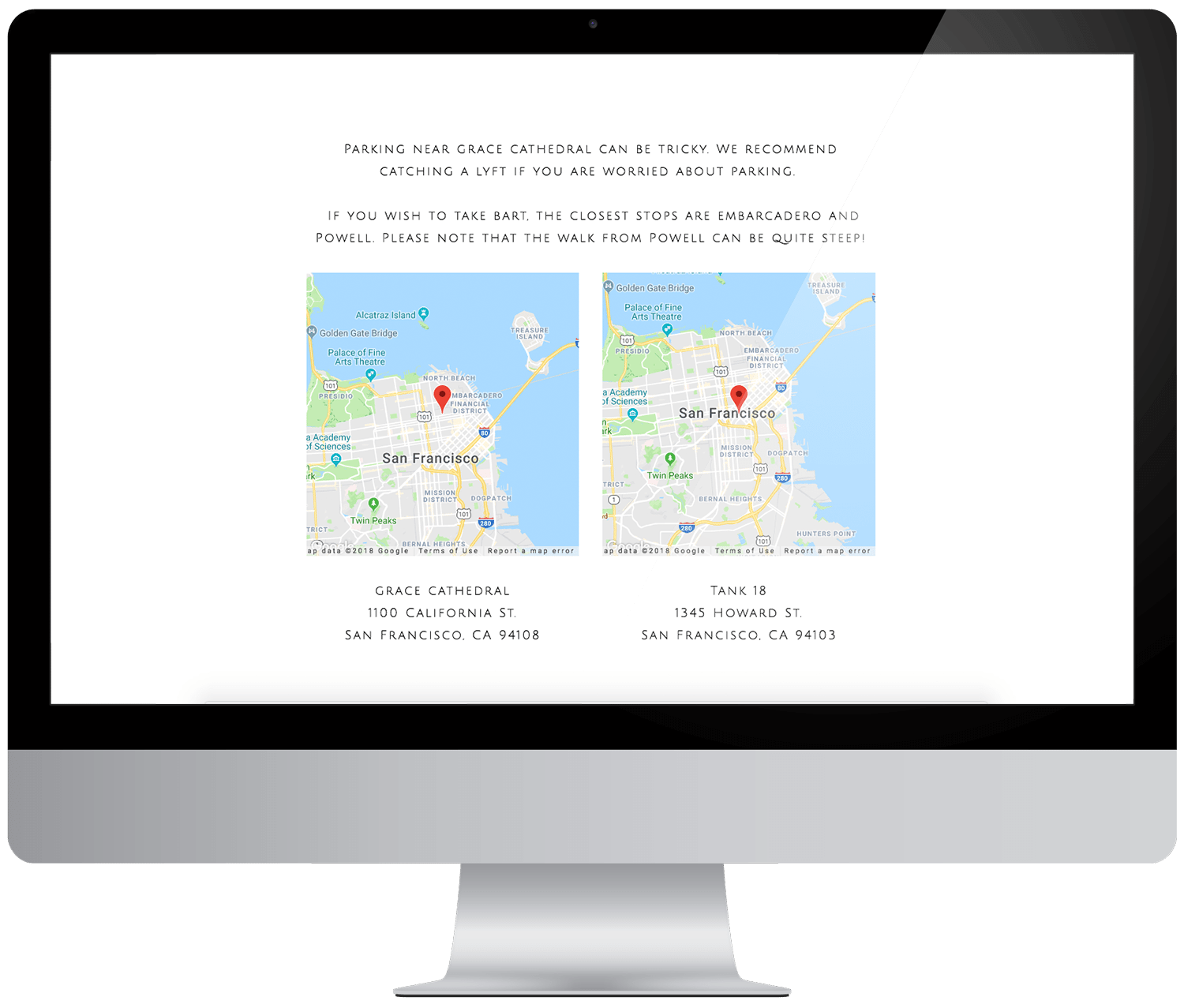
As evidenced by the above, one of the best advances of wedding website design in the last few years is being able to easily integrate a bunch of different tools in one spot, without late nights pulling out your hair. Registry? Check. RSVP? Check. Not only does this make your guests’ lives easier, but it saves you a bunch of money on extra paper goods, so double win. But Squarespace has a few lesser-known features that make things even easier for your guests to get where they need to go. For example, you can easily add Google Maps to any of your site’s pages, so that when the procrastinators and directionally-challenged want to know how to get to your venue, there’s a much lower chance that they’ll accidentally set their GPS for a location with a very similar sounding name that’s all the way across town and almost miss the reception. And since all Squarespace websites are mobile-friendly, even your least tech-savvy family members should be able to find your map, click on it, and start their navigation with ease.

Share your photos & Videos
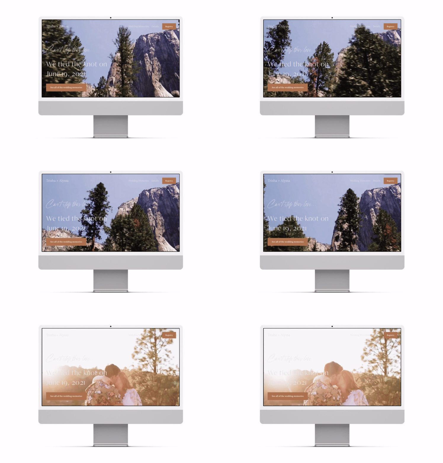
Having gotten married this year in a small celebration, it became quickly clear that our families and friends are very into seeing the photos… like right now. But what if I’m just not ready to share every last image on social media? Well, I didn’t have to because I just converted my Squarespace wedding website into a beautiful photo-sharing platform. (Yes, they want to see pictures after. Yes, they will harass you for them. Yes, you should just share them.) Once the wedding is over, you can easily convert your wedding website into a “just married” page to house more wedding photos, videos, your personal Instagram feed, and anything else your friends and family might want to stay up-to-date on in your married life. (Oh, and leave that registry up—did you know that etiquette says folks have a year to send a gift?) It beats overloading your Facebook feed, is all I’m saying. So sign up for an annual subscription with Squarespace and you can put your wedding website to work for a long time to come.
In this season of life, we’re all too aware that there is no magic wand to wave and make wedding planning a breeze.. but, a well-crafted wedding website will go a long way in keeping your phone from blowing up and your sanity in check. Plus, you can use all that money you saved on paper goods and put it toward important stuff. Like booze. Just saying.

This post was sponsored by Squarespace. Squarespace makes it easy to build a website in a matter of minutes, thanks to their user-friendly software and modern, designer website designs. Every annual Squarespace subscription also comes with a custom domain, and of course, their award-winning customer service (just in case you get stuck). Click here to start a free 14-day trial and make your wedding website today. Our readers (yup, you) get 10% off your first Squarespace purchase when you use the code APW at checkout.


