You’ve meticulously organized your Pinterest board, you know exactly how you want your wedding to look and exactly how you want it to feel. In millennial jargon, that’s a vibe, folx. So how will your guests know what they can expect? Obviously with your wedding website from Squarespace.
Record scratch: but… how? You’re not a designer.
Okay, okay. I know. You’ve seen a ton of wedding websites, most wedding websites are super boring, and you figure as a non-designer that’s likely the best you can do. We all know how most wedding website templates look: A plain background, some decorations at the top, a script font for your names, and places to plug in your info and photos. Maybe you can adjust colors, but maybe not even that. (Maybe you can adjust your genders… maybe not even that.) They sort of all look like this (ugh):
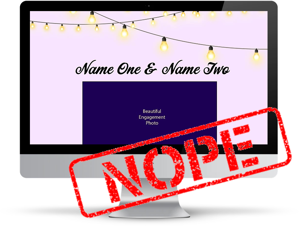
Thankfully, Squarespace has made it easier (and more design-forward) than ever to share your wedding day ~vibe~ with your family and friends, even early on in the process, before you have a ton of cool pictures, or know what your invitations are going to look like (spoiler: Your wedding invitations and wedding website don’t need to match).
If you’ve spent any time around here you know we’re a fan of vibe. Always. And making things easy. Always. So we’ve helped you by creating a bunch of websites (with how-tos) for the following LEWKS:
Wedding Website Templates (+Vibe):
- Urban City
- Desert Bohemian
- Colorful Quirky
- Moody Glam
- Outdoorsy Camp
- Rustic Barn
Here’s what I know from our years of partnership with Squarespace: You can have an original, custom, fancy-looking wedding website that perfectly matches your wedding colors and vibe. The best part? It won’t cost you an arm and a leg, you don’t have to be able to code, and you can get it done in a day! The wedding website templates that Squarespace offers give you the perfect jumping-off point, and you can personalize to your heart’s content.
How to evoke your wedding vibe
One of the things I love most about the templates from Squarespace is that you can choose any of them as a stylistic starting point, and they can be adjusted the tiniest bit to make it yours quickly, or you can dive in and change everything about it to create a completely unique site that looks like nothing you’ve ever seen before.
Because you don’t have the time (and I am paid to do this) I decided to test out all of the wedding website templates that Squarespace offers, and see which ones matched up with which vibe. At first, I dug around for some beautiful photos (courtesy of some of our favorite vendors), which were, of course, gorgeous. Then I thought, what about folx who don’t have engagement photos, or whose photos don’t vibe with their wedding style? So, instead, I used Unsplash to find images that fit with a few different wedding styles. Then I swapped out fonts and colors, moved some little things around, and ta-da. That was it.
What I didn’t do? I did not use any code, I did not hunt for or upload custom fonts, and I did not spend more than ten minutes customizing each version I created. (Because you don’t have that kind of time). So in short, I did something any of you can do even if you’re not a professional designer. (Check out this post for how to get started and a step-by-step how-to guide.) And feel free to copy my designs. No plagiarism worries here!
Squarespace offers six templates that are intended for wedding websites, so I created versions of each one that felt original and fun and totally different from that cliche example at the top of the post.
Wedding Website Templates (And Their Uses)
URban city
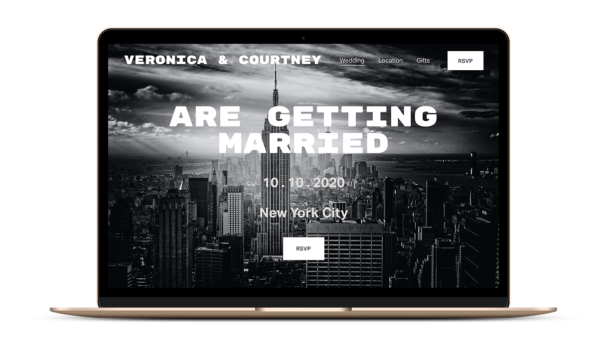
For this site, I started with the Dario wedding website template—a nice, clean template with the option to put a photo filling the whole front page. I wanted to really highlight the urban landscape of New York City. To keep a clean aesthetic I used a bold block font (Rubik Mono One) and simple black, white, and gray color palette.
Desert bohemian
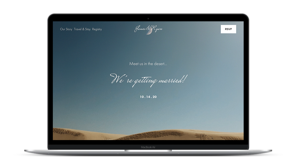
Soria is another classic looking wedding website template to start with. If you’ve got some engagement photos you love, or other snapshots that you’d like to show off, this is a perfect template style—in this case, I found an image of the moon over the desert that honestly makes me think of my dream wedding. Then I chose the main font (Mrs Saint Delafield) that exudes boho chic.
‘What if I don’t have stunning engagement photos?,’ you ask. Have no fear. Do you have some great photos from the last trip you took? A favorite selfie? Or, find some stock photos. For all of these sites, I just popped over to Unsplash, typed in words that matched each style and picked an image I loved to use as the backdrop. You can make a beautiful website using these wedding website templates from Squarespace regardless of what sort of photos you have access to.
Colorful quirky
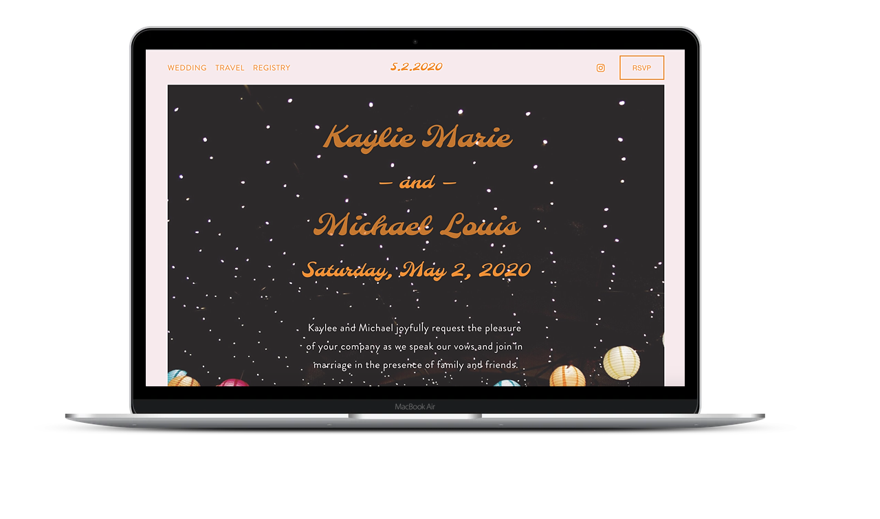
This time, I started with the Morena wedding website template—it was a fun reverse compared to the other options that started with large-format photos, and I just couldn’t help myself but use a fun image from Unsplash. Going for a bold, quirky, colorful energy meant I got to choose this super eclectic font called Molle, and I love the end result.
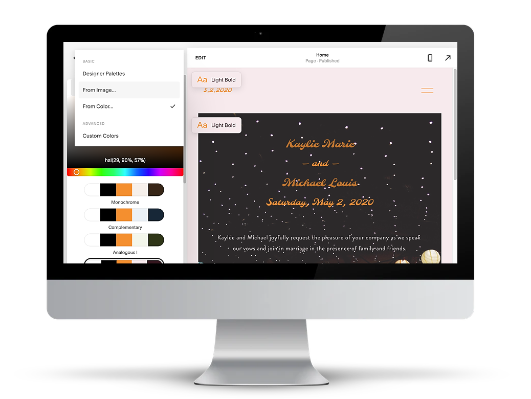
Sometimes choosing colors can be a hard part of the process. Have no fear… Squarespace has already solved this problem for you, even before you knew it was a problem. When you get to the colors section of the design of your site, you can choose from a few options: designer palettes (yay, easy), from color (if you have a Pantone or Hex code, or other colors from your invites, etc.), or… get this… from an image (!!)—you can just pull a picture right into the color chooser and let Squarespace pull a palette from that image. Easy as pie.
Moody glam
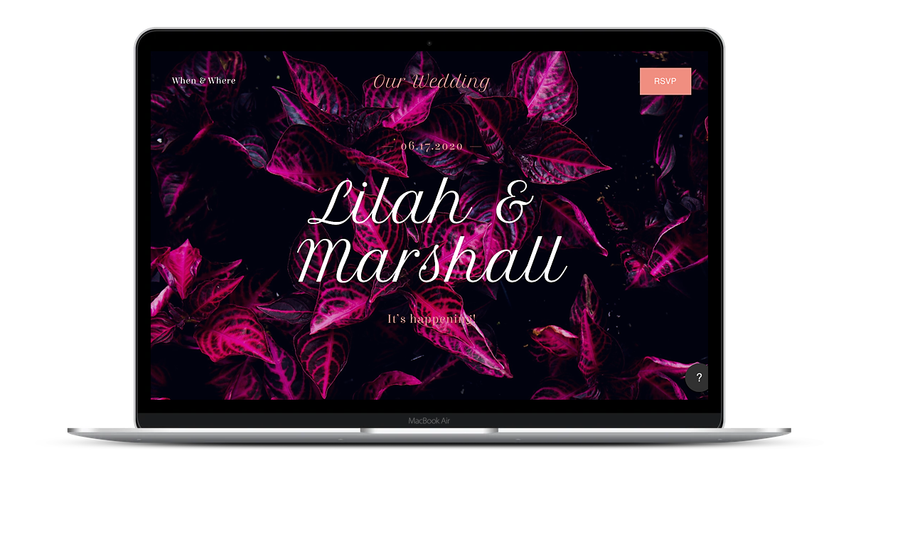
Wedding website templates aren’t just what that front-page space looks like. The Rey template is a favorite because you can add a photo, adjust the size, colors, fonts, and more, of course. And, it also has this really great scroll style where the ‘pages’ seem to all just flow from one to the next as you scroll down. For this one, I used this fun image of a dark and striking plant, added a glamorous main font (Petite Formal Script), and made sure the colors popped against the image. If that doesn’t scream glam, I don’t know what does.
Squarespace uses Google Fonts, so if you get overwhelmed with all the options, they have premade some serif, sans serif, and mixed font pairings for you. I went right to the Google Fonts website to be able to see my options larger and sorted—it made making choices much simpler.
outdoorsy camp
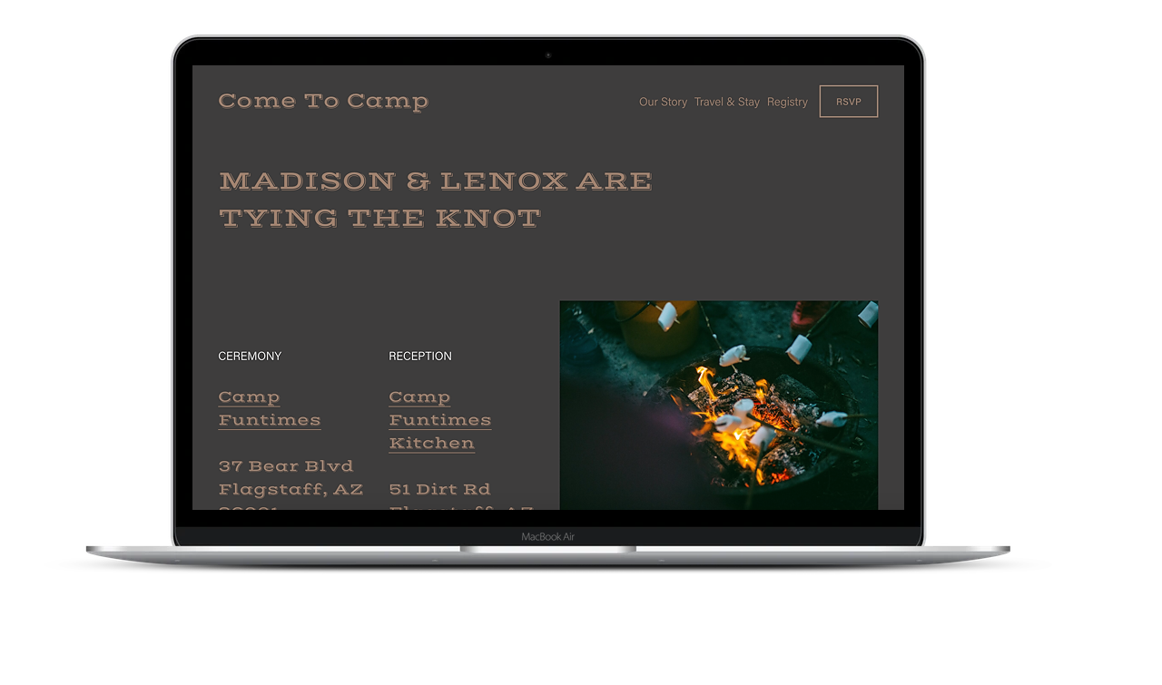
As with all the Squarespace wedding website templates, you are making a choice based just on a starting place—you’re not stuck with anything. With the Lenoix template, I liked the way it started with a left-aligned text section, an image upfront (but not taking up the whole page), and the chance to really make your color choices pop! I played with this template briefly to adjust the fonts and sizes of the text. A quick image from Unsplash of friends roasting marshmallows and your family will know exactly what’s in store.
Rustic Barn
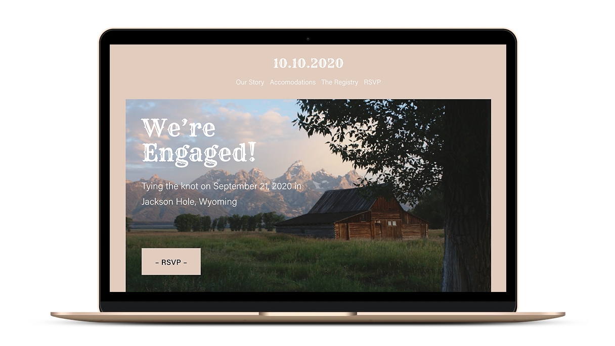
I appreciate that with the Squarespace wedding website templates, including Bleeker, you can tweak the smallest things that make a huge impact. Change the color or shape of your buttons, adjust the layout of the header, leave a simple color as the background, or make the image fill the whole screen. And the Rye font really pulled it together.
Don’t stop there
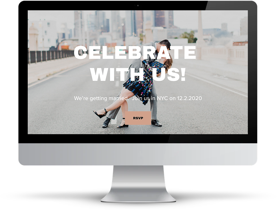
While Squarespace offers the six wedding website templates, they also have a whole lot of other template options to use as your starting place for your design. You don’t need to limit yourself, with Squarespace you can literally turn any website template into exactly what you need it to be.
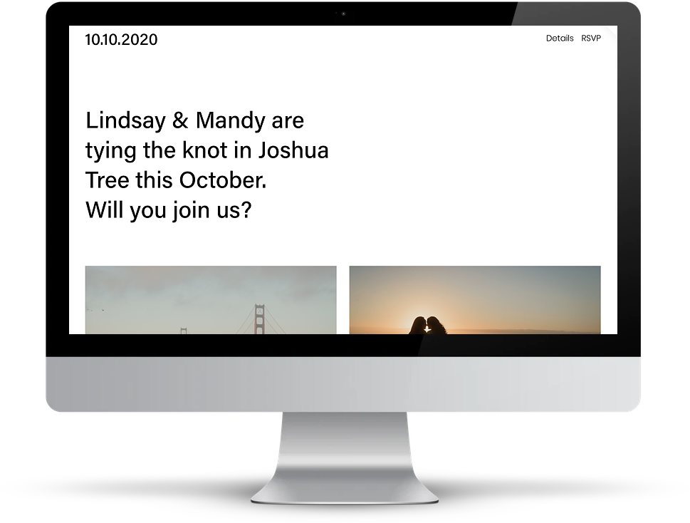
For the one above, I started with Wycoff (which I found in the “events” section). Change some wording, add an engagement photo, and boom. Wedding website. And for the one below, I went to the “photography” section of the template page and used the Balboa template as my starting place—because sometimes you have so many dreamy photos that you need more spots to put them! (but really, you can add a gallery of photos to any of your favorite templates.) Just trust me, Squarespace makes it easy to create a site that doesn’t look like every other wedding website since 2001. Their wedding website templates (and other templates) make it oh so easy.
Now go, make it happen. When Aunt Marge calls next week asking questions, you’ll be so glad all your information is organized in one place, and you can check “make a wedding website” off your list.

This post was sponsored by Squarespace. We are thrilled to be continuing our partnership with Squarespace in 2020, talking about different ways to use their intuitive website building services — your wedding website doesn’t have to look like everyone else. Squarespace provides an all-in-one hub (including everything from a free logo maker to beautiful templates) that makes it easy to build your online home beautifully, even if you’ve never made a website before and have no idea where to start. Not to mention, they’ve got the best help resources and support team around. Click here to get your website (of any kind) started today with a free 14-day trial from Squarespace. APW readers get 10% off your first Squarespace purchase when you use the code APW2020 at checkout.
