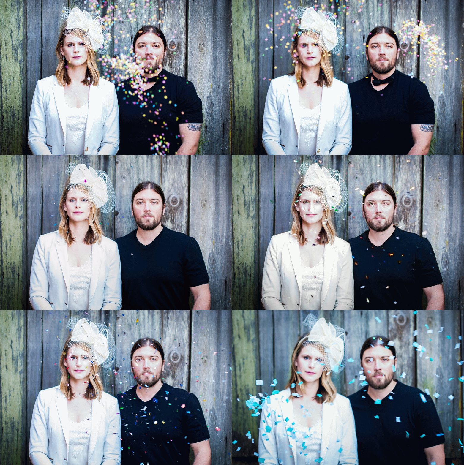
It used to be that you only had two options for customizing a wedding website: use one of the pre-designed templates offered by a big wedding website company. Or learn to code. (Which was how yours truly ended up with an less-than-cute, but otherwise functional orange and brown fall-themed wedding website for her own nuptials.) Thankfully, Squarespace makes it really easy to customize a modern, minimal wedding website that looks it belongs in this century, even if you have no idea what HTML or CSS are. But even still, there’s always that moment before you’re about to embark on a creative endeavor when you stare at the screen and think to yourself, “How the hell do I even start this thing?” So to get you going, here are five tips for creating a wedding website that’s both stylish and informative, without making you tear your hair out, using examples from actual couples who built their wedding websites using Squarespace (and who don’t make their living as professional designers).
1. Focus on the content. The primary objective of your wedding website (other than giving you a project to do in front of the TV while you binge watch episodes of Empire and The Unbreakable Kimmy Schmidt) is to inform your guests of the details of your wedding: who, what, where, and when. As long as that information is covered, everything else is really just for fun and frosting. For tips on what to include in your wedding website, check out this post right here. If you’re feeling intimidated by the prospect of actually designing a site, but want to make things personal anyway, go ahead and use your words as your paintbrush. Nobody ever got mad at a clever wedding website.
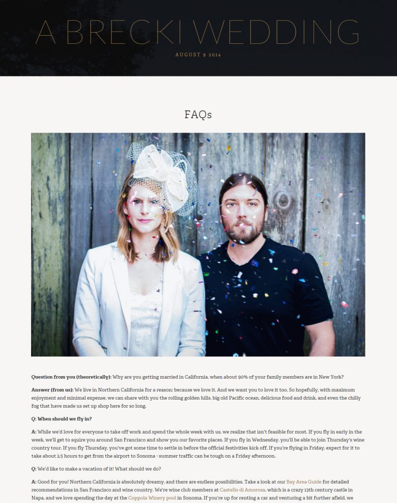
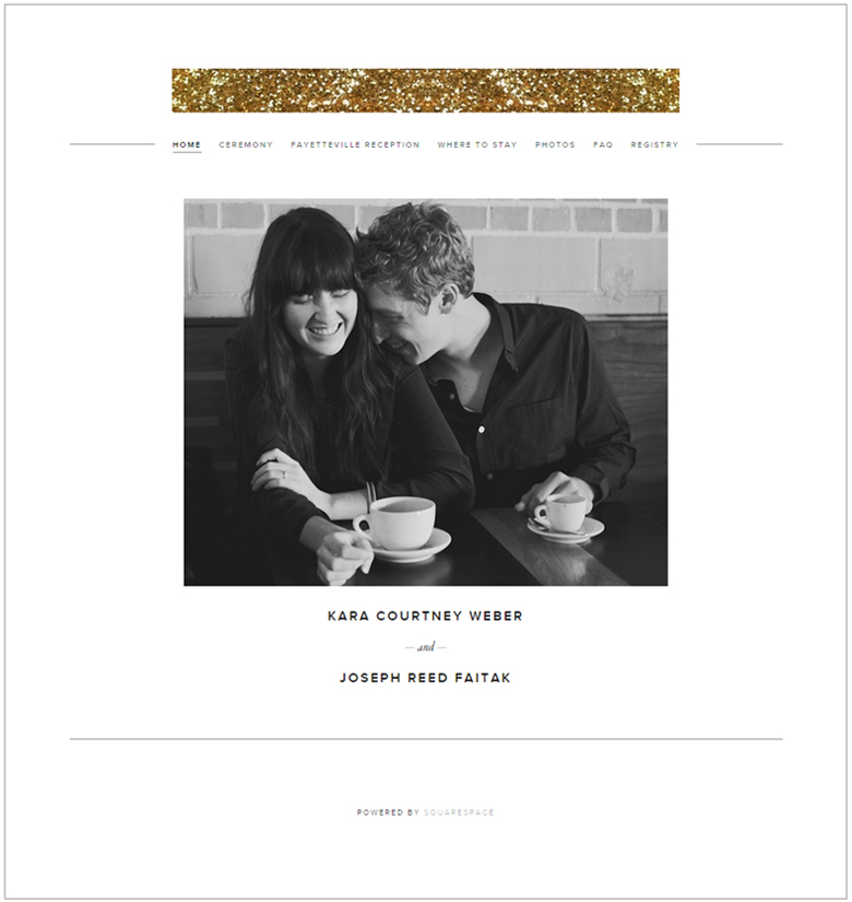
2. Keep it simple. Remember when the requirements for a professional-looking website included fancy backgrounds and lots of design flourishes (more textures! With overlays!)? But blessedly, we currently exist in a space where less is more, and where minimal is modern. So unless you or your partner are illustrators by trade, you don’t need to go crazy over-designing your website. A white background and a clean font go a long way toward giving your website a modern edge, and luckily, most of Squarespace’s templates already start that way. Here’s a great example of a Squarespace site made by an APW couple that doesn’t have a ton of bells and whistles, and frankly doesn’t need them. (Who needs bells anyway, when you have a tiny bit of glitter, amiright?)
3. Picture yourself. Engagement photos serve three functions in this world: 1.) To get you comfortable with your photographer. 2.) To give you plainclothes photos of you and your partner. 3.) To decorate your wedding website. So might as well just lean into it, because big photos are a #lazygirl’s dream—big impact, little effort. Many of Squarespace‘s websites utilize big cover images or front-page slideshows, so find a photo you really love, blow it up, and call it a day. It’s as easy as this:
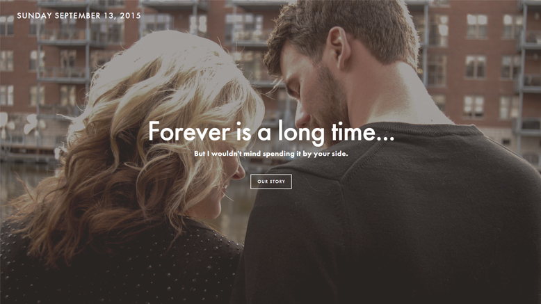
Or this:
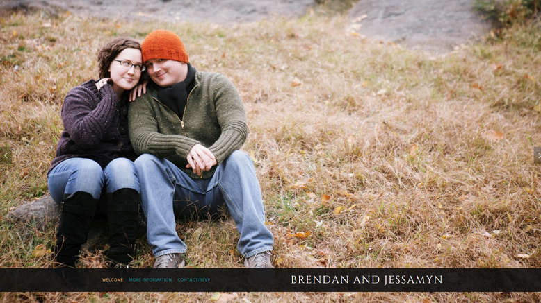
If there are no photos of you and your partner that you love, but you like the look of a full-page photo-focused wedding website, you can always search Flickr for creative commons images that match the vibe of your wedding (like glitter or disco balls or stock photos of the city you’re getting married in).
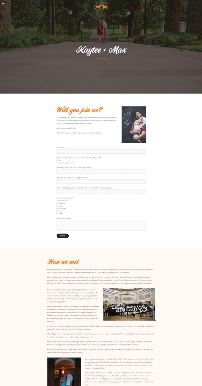
4. Put a logo on it. I know. Talking about “logos” in the same sentence as “your wedding” is weird. But this isn’t about branding your wedding (because you probably aren’t going to be selling your wedding any time soon?) and more about giving yourself a cheat decor motif. And it’s a perfect substitute for photos if you don’t have any. But you don’t need to hire a professional designer to create a simple logo. Squarespace offers a great basic logo-making tool (and we have more tips for designing your logo right here too). When you’re trying to unify your website, simply add your logo to the top of every page and ta-da! Instantly look like you tried really hard. Or use your logo font and color as page headers, like Kaytee and Max did on their single-page scrolling website here:
5. Think outside the box. Squarespace offers a great selection of wedding templates that are set up to be customized quickly and easily. But just because you’re getting married doesn’t mean you’re stuck using a wedding template. So you can always throw caution to the wind and use one of Squarespace’s business templates, or make something up that feels more like you and your partner. Since ninety percent of the people who visit your wedding website are going to go straight to your registry page anyway (and maybe your ceremony and reception location information as the date draws nearer), there’s no need to worry about it being perfect. Just make sure it’s easy to find the information your guests need, and then go as crazy or restrained as you want. Because with Squarespace, you actually have at least have the restrained option.
Did you customize your wedding website using Squarespace? Share it in the comments and give us your best tips!

This post was sponsored by Squarespace. Squarespace makes beautiful wedding websites happen in a matter of minutes, thanks to their user-friendly software and modern, minimal template designs. Thanks Squarespace for helping make the APW mission possible! Click here to start a free 14-day trial and make your wedding website today. APW readers get 10% off yearly subscriptions when you use the code APW15 at checkout.


