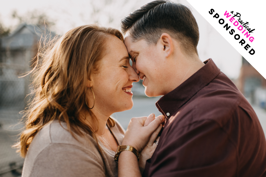
When was the last time you dragged your feet on something for so long that you started to wonder if you’d ever get it done? For me… it was last week. As many of you know, my partner Trisha and I have been engaged since last June. We’ve been planning, un-planning, and re-planning our wedding over the last nine months. And as you definitely know, I write about weddings, specifically wedding websites for a living. Literally. But, did I have a wedding website?
No. I did not.
Did I know that a wedding website would be easy (even fun) to make and make my life much easier?
Yes, I most certainly did.
But it took me until last Thursday to decide that it was finally time to take a dose of my own medicine, listen to all my own advice, and just… do the darn thing. And y’all… it was just as simple, and wonderful as I’ve always promised it would be. Truly.
Want to know how I did it, what I learned, and why I think you should go make a wedding website right now? Okay, okay… I’ll tell you.

First: Don’t Reinvent The Wheel
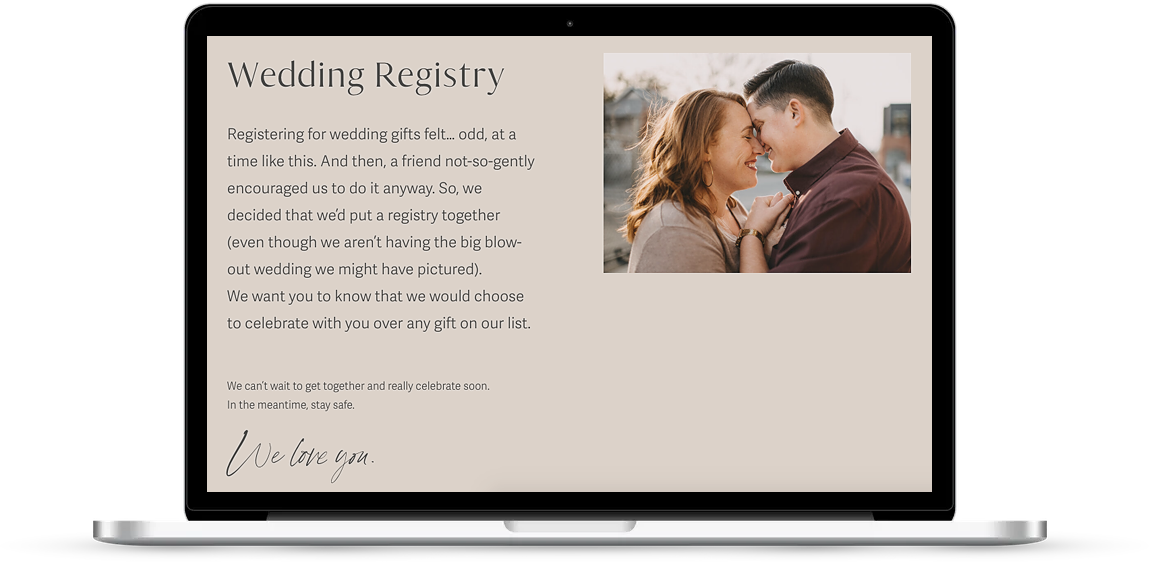
It’s just not worth it. Yes, you could go bury yourself in research, pin every possible example of wedding websites that sparks your interest to a board on Pinterest, make yourself a to-do list that will take you a year to complete… sure, you could. I bet that you would still wake up in a few weeks without a central place where all your family and friends can go look for updates. (This was me! People were texting and asking for updates and I had nothing. Hint: Now I do—password: apw.)
The best part about Squarespace is that you don’t have to reinvent the wheel at all. They have predesigned, modern templates for you to use that are… just simple. You can choose wedding templates that already have a lot of the features sitting there ready for you to utilize. Or, you can choose from hundreds of other options (I chose this one for our website), and add the RSVP page, or remove the store features. All of the Squarespace templates have the same functionality, just with different starting places—so, decide what you like and get to customizing.
Bonus: We’ve done a lot of the prep work for you in our new How To Make A Wedding Website ebook. Y’all… it’s free just for you. It’s got a check list, lists of all the things you’ll want to gather before you get going, and a step-by-step guide that shows you exactly how to get your wedding website done in a weekend (heck, in a few hours!). Oh, and we threw in some top secret resources that will make the process so much easier. Go snag a copy for yourself.
Second: Do The Prep Work
Okay, this one is the classically annoying reminder. But, like cooking a delicious meal, you’re going to want your ‘ingredients’ ready to roll. When I started putting my site together, I instantly found myself drifting off into the deep rabbit hole that is my Google Photos account, and swallowed up by font and color options that I just couldn’t decide between. About an hour into that hot mess, I stopped, looked back at the checklist I wrote for our ebook (talk about taking my own medicine) and knew just what to do.
I closed the Squarespace website and instead opened up a folder on my desktop where I proceeded to gather all the things I would need for my website. I filled the folder with all my favorite photos of Trisha and me, I looked back at my Pinterest board and made a color palette with coolors.co, I even downloaded and saved some fonts. Then, I printed out the checklist, took a hefty dose of my own medicine, and was instantly more productive when I started back to building my site. Don’t make my mistake… get your ‘ingredients’ together before you start mixing!
Three: Keep It Simple
I am a perfectionist, and somewhat of an over-the-top human when it comes to certain things. For example, I want a super laid-back wedding, but my brain tells me that I need the best and fanciest wedding website of all. What is up with that? Just me? As I dove headfirst into creating my own wedding website, I quickly noticed my perfectionist, extra-ness showing and I had to stop it… fast.
What I didn’t do: I did not go to Pinterest and start pulling images of everyone else’s totally perfect magical wedding websites with custom graphics and magic hidden tricks. This could have been the thing that tipped me over the edge.
What I did do: I looked at my checklist (grab the ebook for your copy) and thought about my skills and what I knew I was capable of. I looked back at our plethora of Squarespace posts and remembered just how powerful the adjustment of custom colors and fonts could be, and put my focus there.
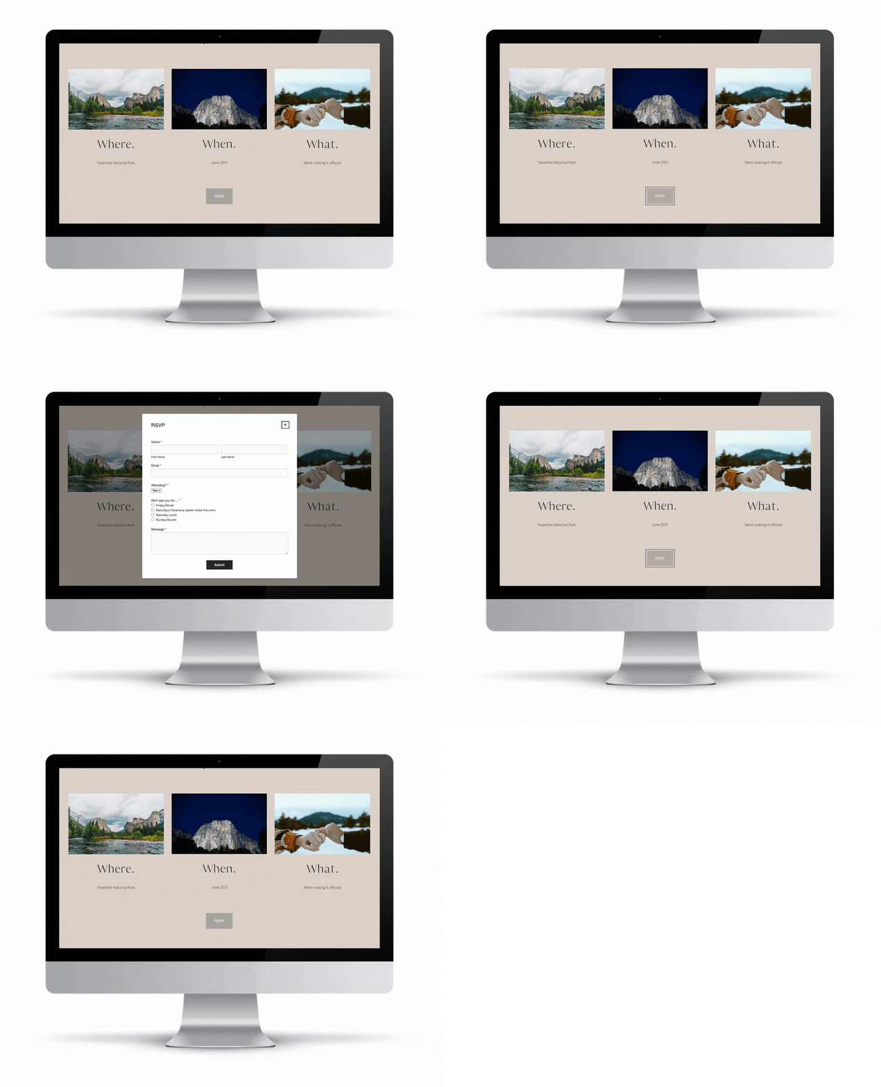
Four: But Also Be Thorough
I’ll say it again (and probably again after that)… THE WHOLE POINT OF YOUR WEDDING WEBSITE IS TO SHARE INFORMATION. So, for the love, please include all the details. Leave no stone unturned. Tell folks about your plans, alert them to changes in plans, let them know about your registry, your timeline, what they should wear… all the things that you want them to know between now and wedding day should be on your website. Oh, and don’t forget to set up an RSVP form.
Don’t worry, we have a really thorough list in our wedding website ebook, and this post will help you know exactly what should be on your wedding website so that your guests are fully informed and no one is left in the dark.
I am not exaggerating when I say that I’ve already saved at least 4 hours of text communication with this website. So glad I finally did it… sure wish I’d done it sooner.
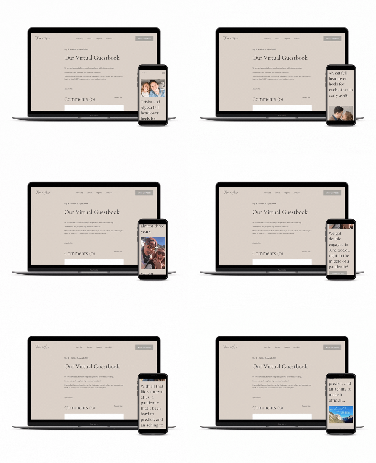
Want to check out the website I built? Check it out here (password: apw).
Your turn, APW. Do you have a wedding website? If not, what’s holding you back? If you do, tell us what you learned so we can all grow from your mistakes and save ourselves a whole bunch of time.
Credits

This post was sponsored by Squarespace. Squarespace makes beautiful wedding websites happen in a matter of minutes, thanks to their user-friendly software and wedding templates. Every yearly Squarespace purchase also comes with a custom URL and, of course, their award-winning customer service (just in case you get stuck). Check out Squarespace’s wedding templates, and start a free 14-day trial and make your wedding website today. And don’t forget to nab your custom URL when you sign up for a yearly account. APW readers get 10% off your first Squarespace purchase when you use the code APW at checkout.

